Sign up for our newsletter to stay up to date with
the latest HFLOR/HIMACS design trends and news.
HIMACS: BW Bank
HIMACS helps modernize a bank in Stuttgart
Banks are a firmly established element of the inner city landscape. Traditionally, impressive facades are designed to enhance the reputation of such institutions, giving them presence.
With a view to re-interpreting this traditional image, the Baden-Württemberg Bank (BW Bank) commissioned the re-design of the ground and upper floors of its branch in Stuttgart to provide a contrast. Attractive interior details finished with HIMACS form the core style of the re-design. Stuttgart-based firmWittfoht architekten took on the task of re-designing both floors.
On completion of comprehensive renovation work, the building was re-opened on February 2012. In re-designing the service area on the ground floor and the precious metal and currency bureau on the first floor, the factors of security, work station layout and a customer focus needed to be taken into consideration. Offices for Private Banking and the Bank’s customer business are located on levels 2 and 3.
The brief for the interior of this branch of the BW Bank was to give it a human face through the use of a harmonising formal language. Wittfoht architekten has achieved this through the use of colour, form and materials. The Stuttgart architects have used the circle as the guiding principle. "A circle is at one and the same time the simplest and most significant form of layout, as all points are equi-distant from the central point. There is no foreground or background, beginning or end", says Professor Jens Wittfoht. Totally the right shape in this instance: the requirement was to create an interior design facilitating smooth working processes and interaction with customers within the bank – architecture used to manage social and business relationships. The circle is also a highly appropriate symbol for the cycles operating in the banking sector – you only have to think of your own Giro account (Italian giro = turning).
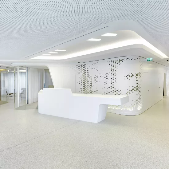
An area is partitioned off by a type of double wall between the SB hall and the service area incorporating specific banking facilities such as cash machines and safety deposit boxes, meaning that general banking processes are not disturbed. Wittfoht architekten chose HIMACS for this monolithic partition for its optical depth. The clever use of lighting alcoves gives the wall unexpected lightness.
The HIMACS colour white Lucent Opal not only emphasizes the specific features of the Solid Surface material but also suggests superior quality through its translucency, which reminds one of alabaster. Brown and gray shades were used in addition to the white to pick out certain areas and break up large surfaces from an optical point of view. Special areas such as leather seating lining parts of the entrance areas were deliberately created in beige to increase the sense that you can linger in a safe and warm place.
The salient performance properties of HIMACS are evident right from the SB area: a protruding bag shelf has been created under the cash machines in the wall from this thermo-formable material. This use of its properties is clear proof of the ideal application of this resistant material in areas of the bank accessible throughout the day. There are no areas vulnerable to deliberate damage plus plenty of scope for creating three-dimensional homogeneous shapes and superior surface quality.
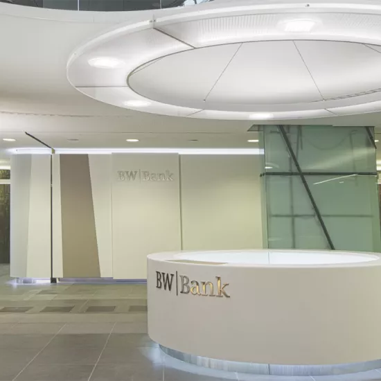
The right-angled gallery that once separated the ground and first floors has been closed off. A new and smaller ceiling aperture now features in the entrance hall area. On entering, visitors are automatically guided to the left towards the reception desk, tellers and service desks – all made of HIMACS. The round ceiling aperture breaks up the stark horizontality of the entrance hall.
Because all of the internal architectural features have been made from HIMACS Lucent Opal, all of the various areas of the bank are linked as an optical continuum extending from the reception desk in the entrance hall to the SB and service area on the ground floor and the currency bureau on level 1. "Thanks to the seamless properties of HIMACS, all items appear to be poured from the same mould", say wittfoht architekten, "which enabled us to use specific approaches to enhance the various spaces within the bank.”
"We chose HIMACS for a number of reasons. Firstly, the material needed to be both robust and solid, which has symbolic significance for the bank, secondly we were looking for a hi-tech material with a warm haptics and thirdly we were fascinated by the translucency and optical depth” said the architects. The bank also love the homogeneous appearance created by HIMACS. With its effect of depth, the white material underscores the reserved elegance of the office areas and superior quality of the currency bureau. The aim was to create a calm aesthetic balance between layout and coordination through form and colour and eliminate any inconsistencies".
| Architecture & Design | wittfoht architekten, Stuttgart |
| Material used | HIMACS Lucent Opal |
| Fabrication | Obermehler und Wüst Praxis - Inneneinrichtungen GmbH, Pforzheim |
| Photo Credit | Andreas Körner, Stuttgart |
| Press Release Download press release | |
Project gallery
-
Download images
If you are a journalist, it is possible to select the medias you want and ask us to provide them in HD.
ORDER PROJECT IMAGES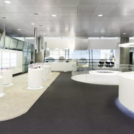
-
Download images
If you are a journalist, it is possible to select the medias you want and ask us to provide them in HD.
ORDER PROJECT IMAGES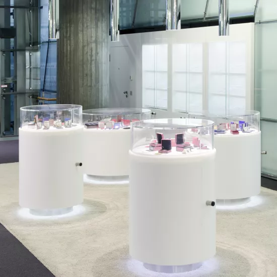
-
Download images
If you are a journalist, it is possible to select the medias you want and ask us to provide them in HD.
ORDER PROJECT IMAGES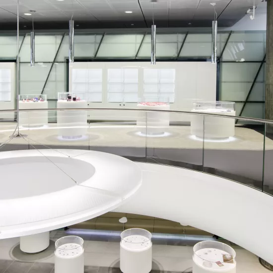
-
Download images
If you are a journalist, it is possible to select the medias you want and ask us to provide them in HD.
ORDER PROJECT IMAGES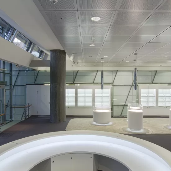
-
Download images
If you are a journalist, it is possible to select the medias you want and ask us to provide them in HD.
ORDER PROJECT IMAGES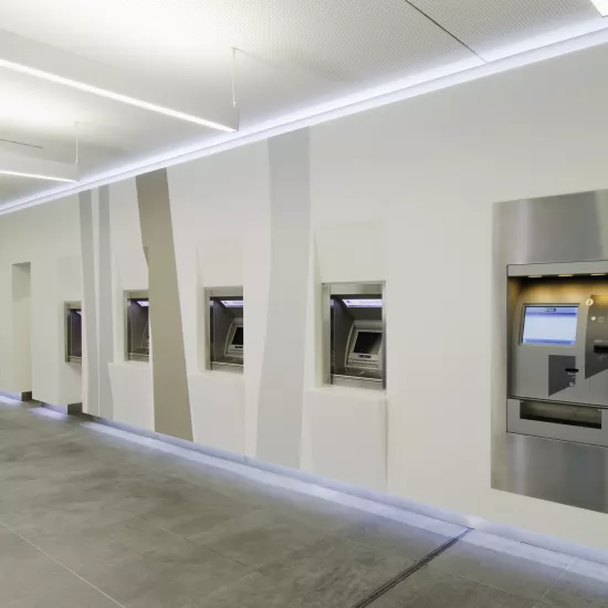
-
Download images
If you are a journalist, it is possible to select the medias you want and ask us to provide them in HD.
ORDER PROJECT IMAGES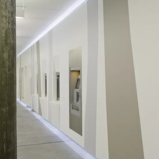
-
Download images
If you are a journalist, it is possible to select the medias you want and ask us to provide them in HD.
ORDER PROJECT IMAGES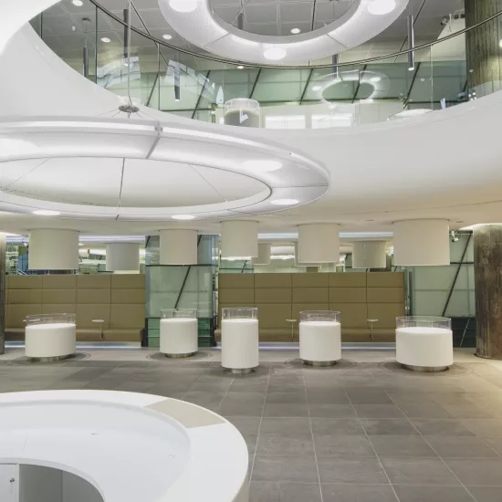
-
Download images
If you are a journalist, it is possible to select the medias you want and ask us to provide them in HD.
ORDER PROJECT IMAGES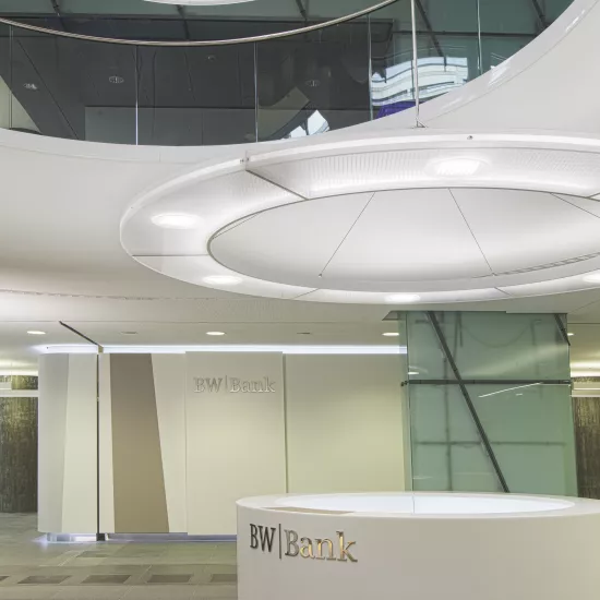
-
Download images
If you are a journalist, it is possible to select the medias you want and ask us to provide them in HD.
ORDER PROJECT IMAGES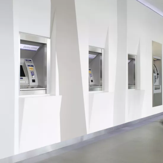
-
Download images
If you are a journalist, it is possible to select the medias you want and ask us to provide them in HD.
ORDER PROJECT IMAGES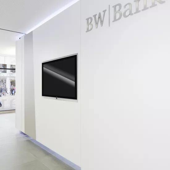
-
Download images
If you are a journalist, it is possible to select the medias you want and ask us to provide them in HD.
ORDER PROJECT IMAGES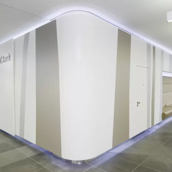
-
Download images
If you are a journalist, it is possible to select the medias you want and ask us to provide them in HD.
ORDER PROJECT IMAGES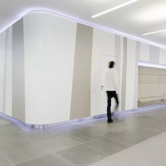
-
Download images
If you are a journalist, it is possible to select the medias you want and ask us to provide them in HD.
ORDER PROJECT IMAGES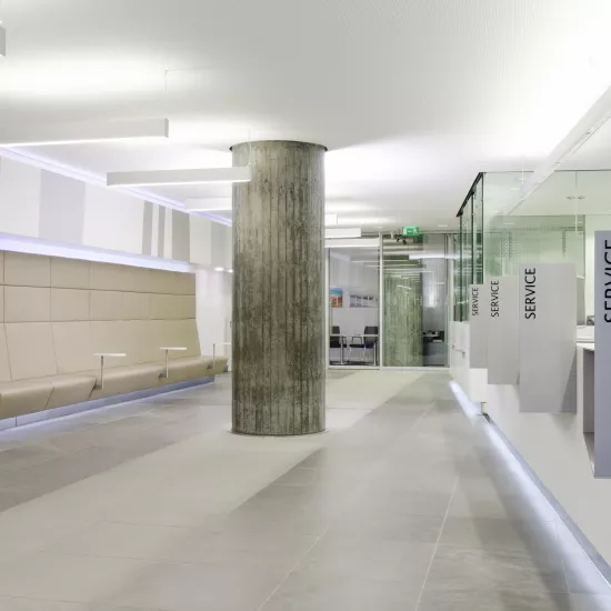
-
Download images
If you are a journalist, it is possible to select the medias you want and ask us to provide them in HD.
ORDER PROJECT IMAGES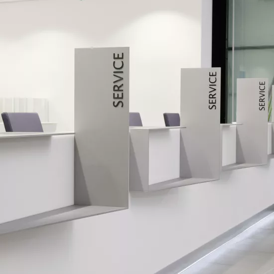
-
Download images
If you are a journalist, it is possible to select the medias you want and ask us to provide them in HD.
ORDER PROJECT IMAGES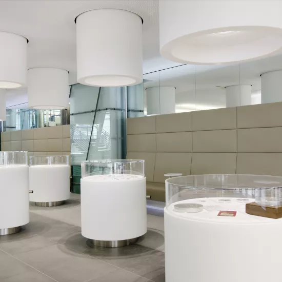
-
Download images
If you are a journalist, it is possible to select the medias you want and ask us to provide them in HD.
ORDER PROJECT IMAGES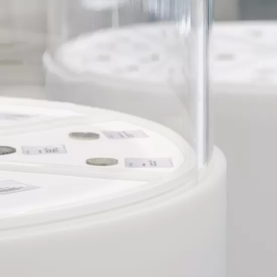
-
Download images
If you are a journalist, it is possible to select the medias you want and ask us to provide them in HD.
ORDER PROJECT IMAGES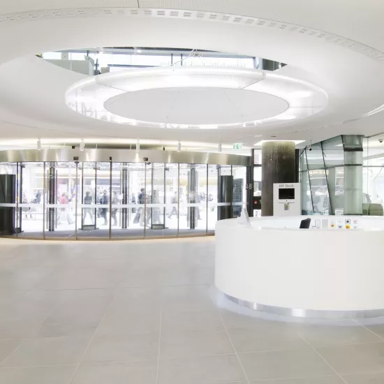
-
Download images
If you are a journalist, it is possible to select the medias you want and ask us to provide them in HD.
ORDER PROJECT IMAGES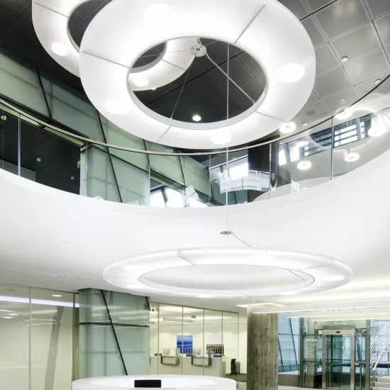
Image library
Added to your Image Library
Go to Image Library page to request HD images, or click OK to continue your image selection.
Media contact
Bumsoo Kim +49 (0)69 583 029 453 bskim@lxhausys.com
Mariana Fredes +41 (0) 79 693 46 99 mfredes@lxhausys.com

