Sign up for our newsletter to stay up to date with
the latest HFLOR/HIMACS design trends and news.
An extraordinary entrance in HIMACS for HanseMerkur
A sculpture-like flying roof and an extraordinary entrance in HIMACS for HanseMerkur
Architects Wasfy Taha and Fionn Mögel from Querkopf-Architekten were assigned with the task to create a new face for HanseMerkur company in Hamburg.
What the architects found at the existing building near the Dammtor train station was an inconsistent "architectural mix".
The offices of this traditional company are located in the historic old building "Haus Wedells", which consists of a structure from the 90s and a glass atrium. An extended entrance hall was used to create the link between the different eras, while making a dramatic architectural statement.
The architects from Querkopf-Architekten decided to devise the entrance as a sculpture, architecturally merging the "past" and the "present" into the "future". This is not only reflected in the futuristic design but also in the chosen material: the New Generation HIMACS solid surface material.
The architects deliberately thought "outside the box" and designed the entrance hall as an expressive continuation of the glass atrium into the urban space. The basic shape of the entrance is a rectangular pavilion with a six metre continuous glass façade and a full glass ceiling stretching over six metres without any supports. There are no pillars inside the structure; steel beams are used to transfer the load to the façade mullions. The construction process was complicated, as an underground car park had to be taken into consideration in the structural analysis.
Flying roof offering an overwhelming sense of space
The powerful aesthetics and optical alignment of the building towards the South-West are achieved with the superimposed HIMACS roof which looks like a sculpture on top of the glass pavilion. It spreads asymmetrically towards the South-East, in the direction of the entrance, standing out by six metres at an acute westward angle. On the north side, the roof develops into a façade: two diagonally tapering "fingers" reach down to the ground here, creating the "spine" of the building.
"The flying roof offers an overwhelming sense of space. It gives the impression of absolute weightlessness", says architect Wasfy Taha. "This visual lightness is created by the shape of the roof on the one hand. But the material also plays a key part. The shimmering soft appearance of HIMACS acrylic stone creates this visual effect", explains Querkopf partner Fionn Mögel. Until now, the architects have been using the solid surface material mainly for bathroom or office equipment in indoor areas. Its versatile characteristics inspired them to use it in their HanseMerkur project. Thanks to its resistance to weather and UV radiation as well as its general durability, this new generation material, consisting of 67 percent natural minerals, 30 percent high-quality acrylic and 3 percent colour pigments, is frequently becoming the material of choice for outdoor areas, as it not only meets the requirements but exceeds them by offering additional design benefits. HIMACS offers thermoformability and a seamless finish. This means that there are no limits in terms of shapes. Each façade, roof or any other object looks flawless once finished. At the same time, very large formats can be created without affecting the stability of the structure.
Approximately 100 panels with the greatest possible dimensions
This very effect was also achieved with the extended roof of the HanseMerkur entrance hall. The roof not only makes a lasting visual impression but also has a practical function by providing shade inside the pavilion and protecting the driveway from rain.
The sculpture-like roof consists of a shell made up with 100 solid surface material panels seamlessly attached to a steel and wood substructure. The individual parts are joined to ensure a seamless finish of the structure after its completion, with the exception of drainage and expansion gaps. As with conventional façades, the 12 mm HIMACS S728 panels in Alpine White are mounted using clasps and BWM rails. The sophisticated planning process and structural analysis were developed by the solid surface experts at Likoo in close cooperation with the architects. They also fabricated the HI‑MACS® panels and facilitated the installation on site.
Interior design picks up on the formal language of the sculpture-like roof
The entrance hall with its extraordinary roof provides the link between two very different architectural styles and various outdoor areas in the overall building ensemble. The south side bordering on the old building at a 90 degree angle only reveals the glass façade. It takes a back seat for the benefit of Haus Wedell and even reflects it. At the same time, it opens up the building to the main traffic and visitor stream, offering a view into and out of the building. The north side on the other hand is facing a park and the classical punctuated façade of the 90s structure. "This is the really exciting part of the pavilion", says Wasfy Taha. "The protruding and receding peaks and edges of the roof and the down-reaching "fingers" create an exciting dynamic."
The design of the generous interior also flows into the overall concept. "A HIMACS desk picks up on the formal language and the dynamic of the sculpture-like roof. It reflects the shape inside the building. Even its alignment will conform to the lines of the building", the architects explain.
| Location | Siegfried-Wedell-Platz1, Hamburg, Germany |
| Architecture & Design | Querkopf Architekten GmbH, Wasfy Taha, Fionn Mögel |
| Material used | HIMACS-FR Alpine White S728 (12 mm) |
| Fabrication | Likoo / Betriebsgesellschaft GmbH |
| Photo Credit | © Dominik Reipka Fotograf |
| Other | MOUNTING SYSTEM: KEIL Befestigungstechnik GmbH, Engelskirchen |
| Press Release Download press release | |
Project gallery
-
Download images
If you are a journalist, it is possible to select the medias you want and ask us to provide them in HD.
ORDER PROJECT IMAGES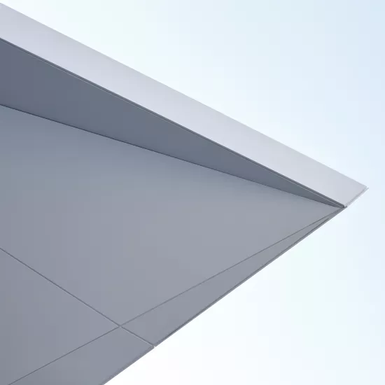
-
Download images
If you are a journalist, it is possible to select the medias you want and ask us to provide them in HD.
ORDER PROJECT IMAGES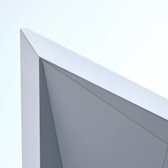
-
Download images
If you are a journalist, it is possible to select the medias you want and ask us to provide them in HD.
ORDER PROJECT IMAGES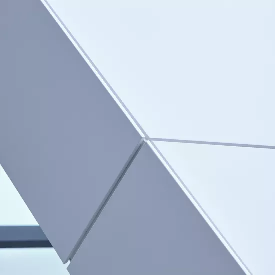
-
Download images
If you are a journalist, it is possible to select the medias you want and ask us to provide them in HD.
ORDER PROJECT IMAGES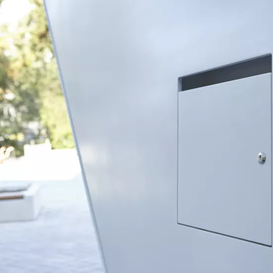
-
Download images
If you are a journalist, it is possible to select the medias you want and ask us to provide them in HD.
ORDER PROJECT IMAGES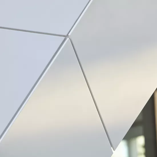
-
Download images
If you are a journalist, it is possible to select the medias you want and ask us to provide them in HD.
ORDER PROJECT IMAGES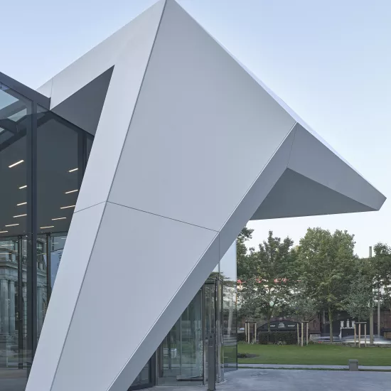
-
Download images
If you are a journalist, it is possible to select the medias you want and ask us to provide them in HD.
ORDER PROJECT IMAGES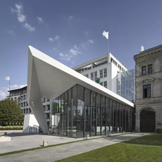
-
Download images
If you are a journalist, it is possible to select the medias you want and ask us to provide them in HD.
ORDER PROJECT IMAGES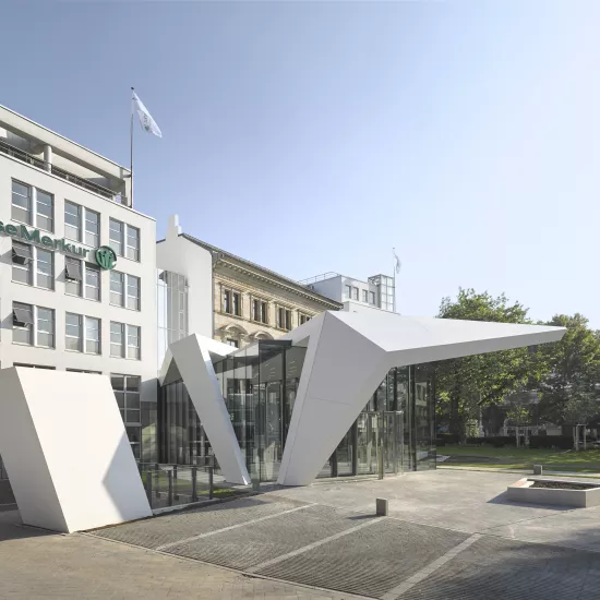
-
Download images
If you are a journalist, it is possible to select the medias you want and ask us to provide them in HD.
ORDER PROJECT IMAGES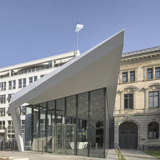
-
Download images
If you are a journalist, it is possible to select the medias you want and ask us to provide them in HD.
ORDER PROJECT IMAGES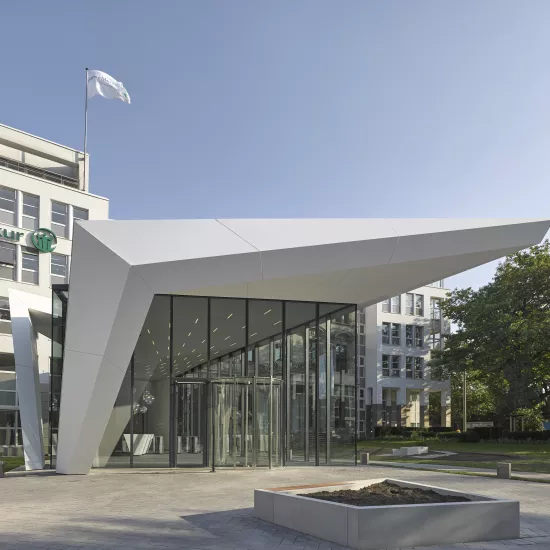
-
Download images
If you are a journalist, it is possible to select the medias you want and ask us to provide them in HD.
ORDER PROJECT IMAGES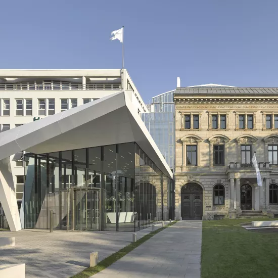
-
Download images
If you are a journalist, it is possible to select the medias you want and ask us to provide them in HD.
ORDER PROJECT IMAGES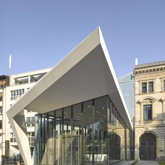
-
Download images
If you are a journalist, it is possible to select the medias you want and ask us to provide them in HD.
ORDER PROJECT IMAGES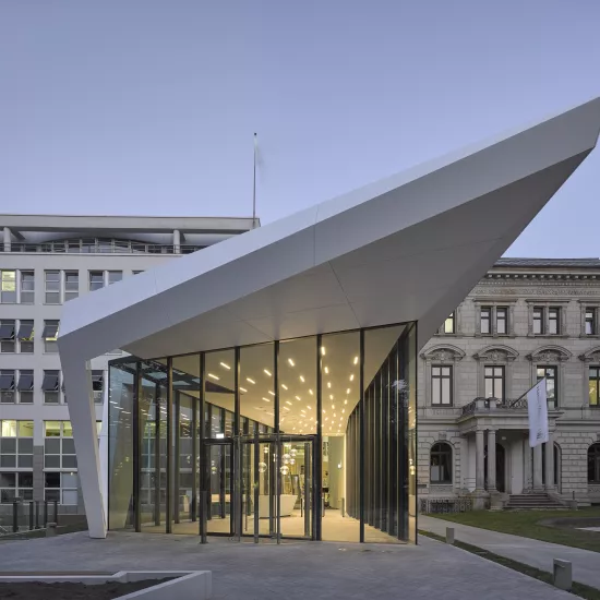
-
Download images
If you are a journalist, it is possible to select the medias you want and ask us to provide them in HD.
ORDER PROJECT IMAGES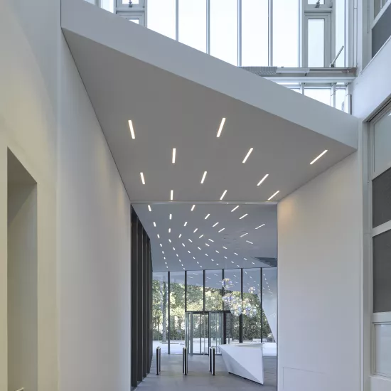
-
Download images
If you are a journalist, it is possible to select the medias you want and ask us to provide them in HD.
ORDER PROJECT IMAGES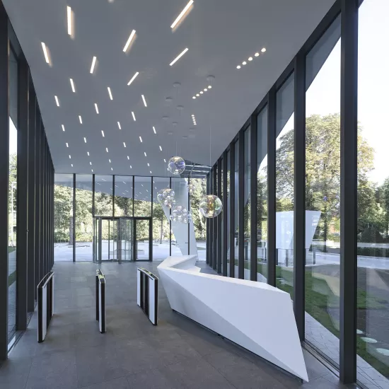
-
Download images
If you are a journalist, it is possible to select the medias you want and ask us to provide them in HD.
ORDER PROJECT IMAGES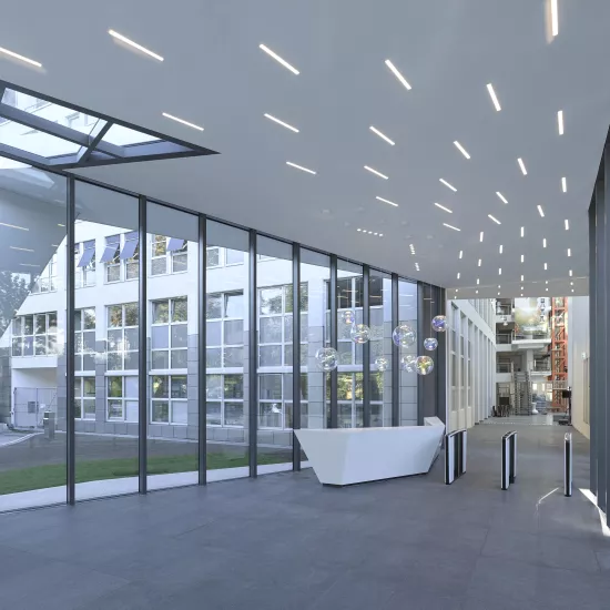
-
Download images
If you are a journalist, it is possible to select the medias you want and ask us to provide them in HD.
ORDER PROJECT IMAGES
-
Download images
If you are a journalist, it is possible to select the medias you want and ask us to provide them in HD.
ORDER PROJECT IMAGES
-
Download images
If you are a journalist, it is possible to select the medias you want and ask us to provide them in HD.
ORDER PROJECT IMAGES
Image library
Added to your Image Library
Go to Image Library page to request HD images, or click OK to continue your image selection.
Media contact
Mariana Fredes +41 (0) 79 693 46 99 mfredes@lxhausys.com
Agnieszka Papież +48 (0) 504 976 688 apapiez@lxhausys.com


