White is a versatile color that makes designing a beautiful kitchen an easy task. Principles of color psychology note that it’s a fresh and bright color that exudes simple feelings of cleanliness and purity. White creates harmony and balance across your space.
Here, we’re going to discuss some white small kitchen design ideas that provide you with a minimalistic and bright space. Read on to create a kitchen floor plan that exudes contemporary contrast and modern moods.

Install Creamy Floors
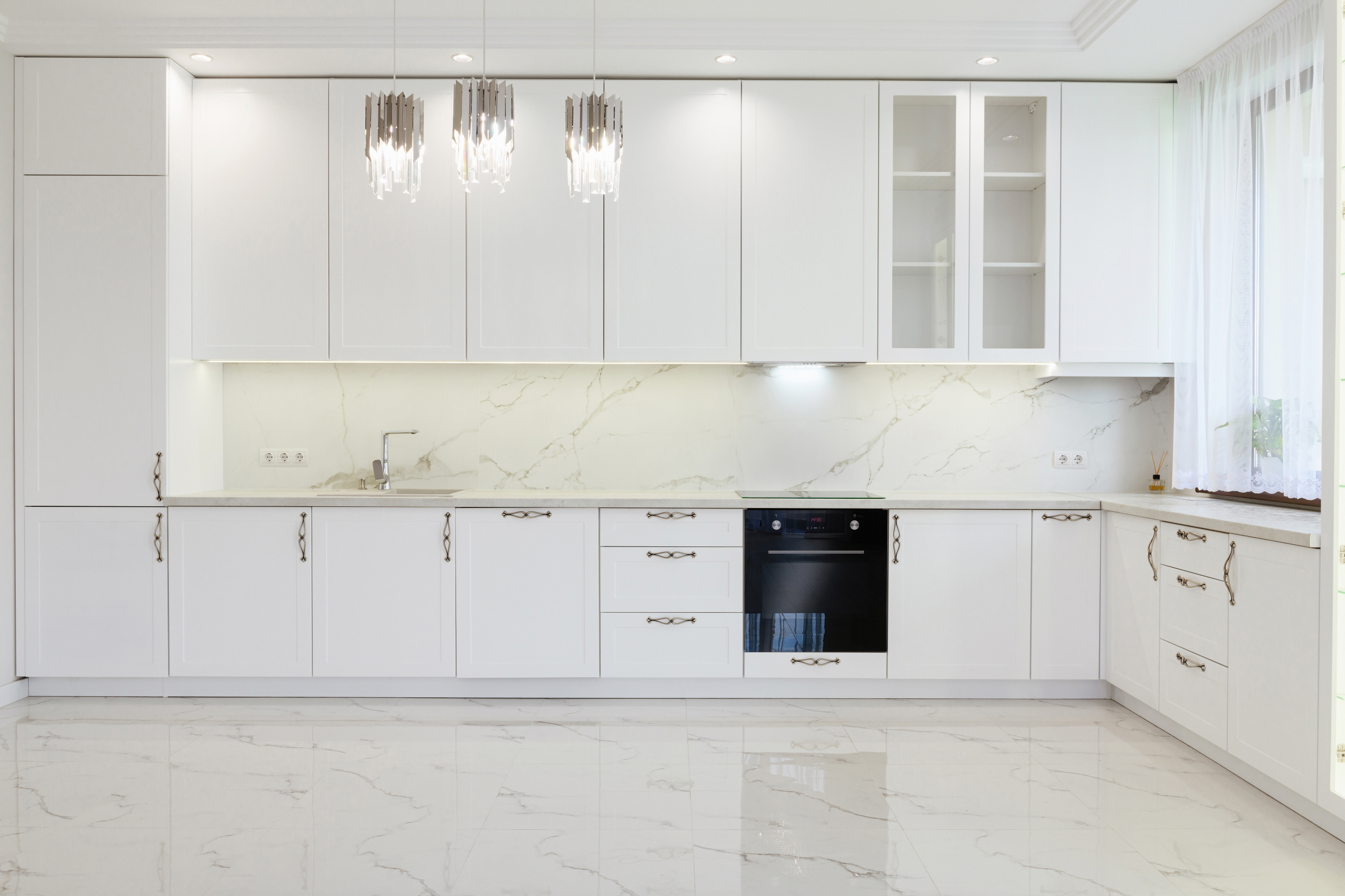
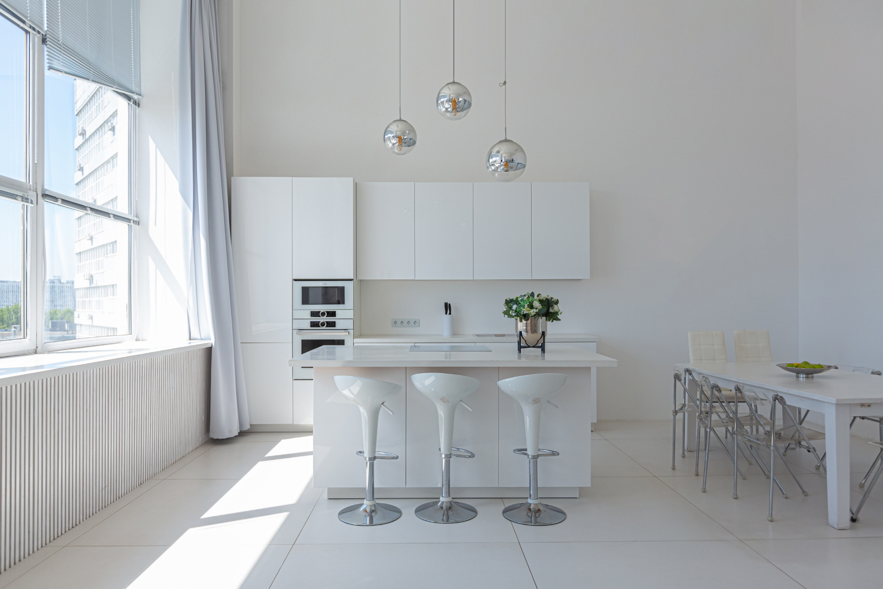
Cream-hued floors look amazing in a white kitchen. They have warm undertones that do well with both natural and artificial light. Installing creamy flooring makes your kitchen look softer as well as sophisticated.
Many materials lend well to creamy colors. Porcelain has a mature and elegant vibe because of its shining finish. Laminate tile is a durable alternative that’s easy to replace in sections when damaged in a small area.
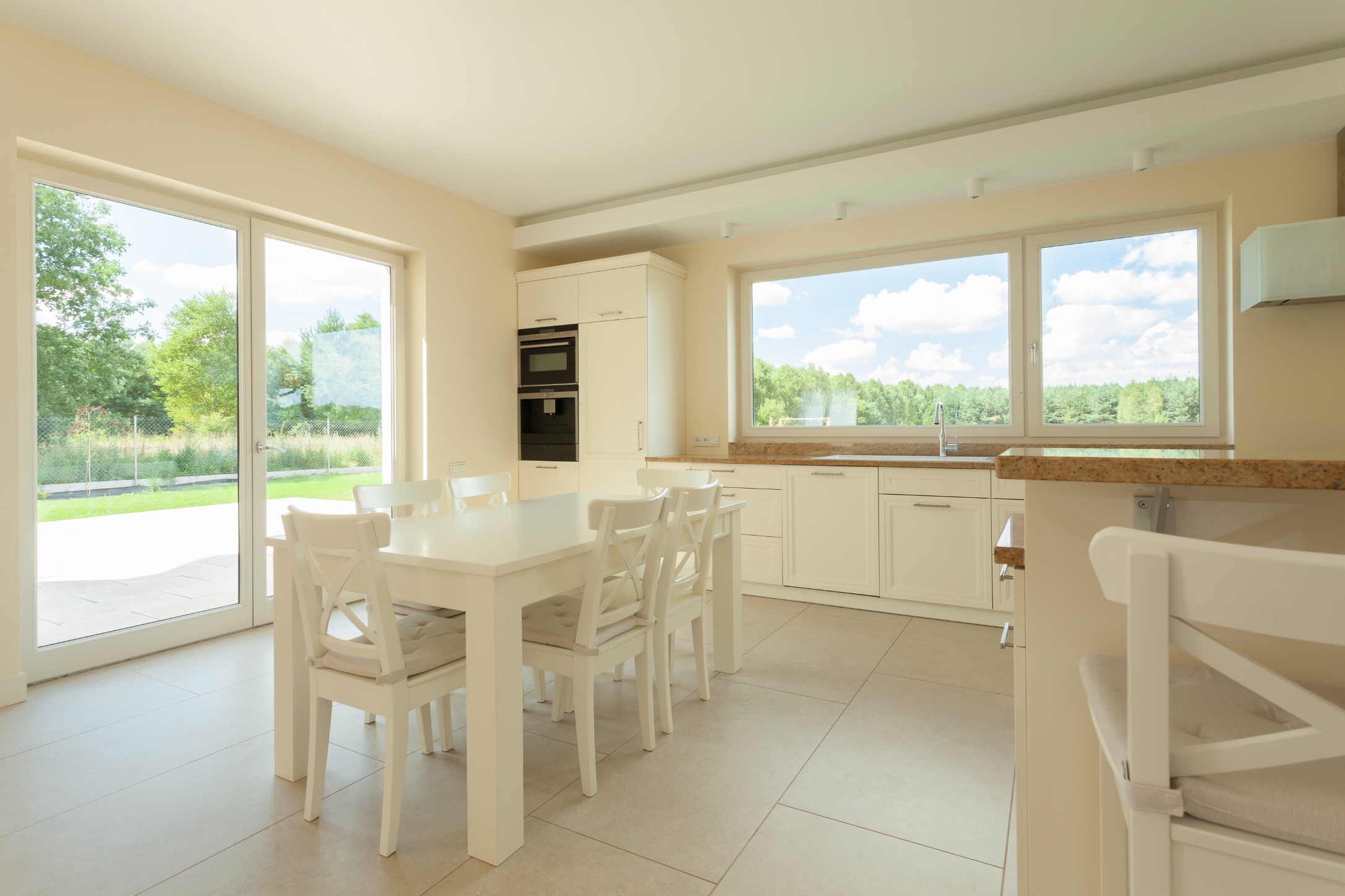
Use Large Floor Tiles
Large floor tiles are usually 12×24 inches or bigger. While it’s easy to remove vinyl flooring regardless of its size, large tiles come with many visual benefits that smaller ones don’t offer.
Those creating white kitchens want their space to look clean and smooth. Large floor tiles have fewer grout lines than larger ones because each tile takes up more space. This makes the floor look smoother and reduces the number of gray or black lines on your flooring.
Using bigger tiles also makes your kitchen look more open and spacious. This is especially important for small kitchens since larger open floor plans can add a feel of opulence and provide the illusion of space.
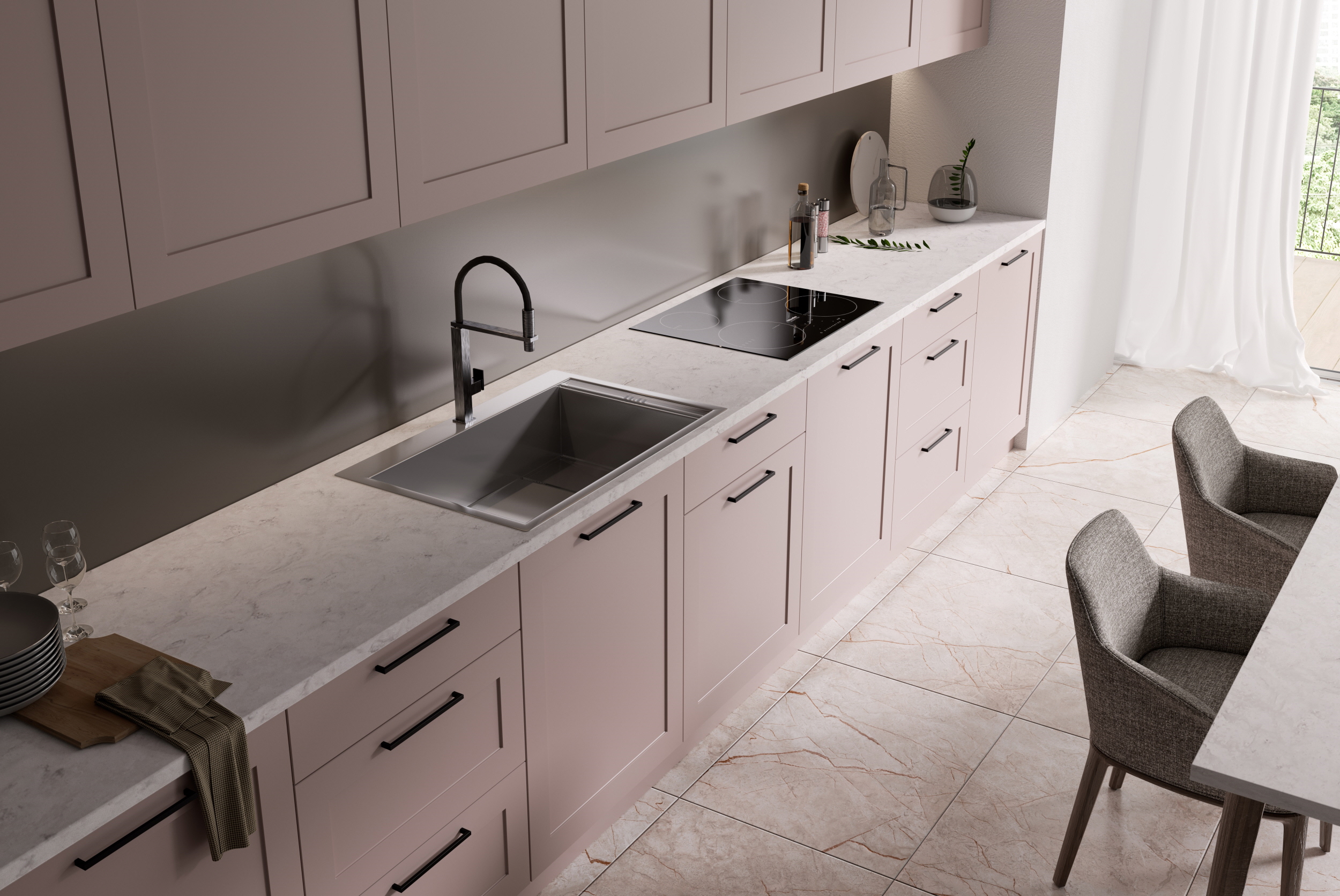
Make a Cozy Mood With a Rug
A spacious vibe is important, but it’s just as critical for small spaces to feel cozy and comfortable. Putting a waterproof rug in the middle of your kitchen creates a homelike feel and reminds you that your space is a sanctuary.
You can also place the rug in front of your sink or island rather than as a floor centerpiece. This will depend on the precise layout of your kitchen floor plan. The ball’s in your court, so experiment and see what looks best.

Use Various Shades of White
Many people like their rugs to be blue, green, red, or yellow. This is a great idea since adding a pop of color to a white room makes the bright, clean shades of white stand out. It also provides some visual complexity that stops the room from feeling barren and sanitized.
But using multiple shades of white also stops the room from looking isolated and empty.
Using a cream-colored rug against eggshell floor tiles lets you contrast warm undertones with cool ones. But this contrast shouldn’t stop there. If your cabinets are a soft ivory color, you can make them stand out against pearl-hued appliances that sparkle and shine.
Make a Neutral Mood
White is a neutral hue because it’s technically the absence of color. It goes with literally everything including black and all colors of the rainbow.
Neutral colors like white are timeless classics that never go out of style. They also serve as a consistent backdrop for your small kitchen even when color trends change. Creating a neutral mood with different white shades means an evergreen design.
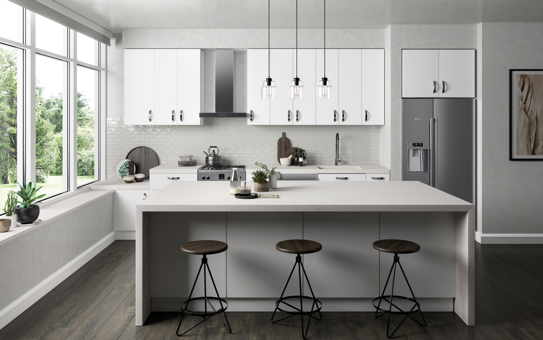
Add a Natural Mood With Wood
There are two ways to use wood in a kitchen design scheme. The first is to create cabinets and shelves with wood and paint them. They can be white or any other color you like.
The second is to use natural-look wood to get your white kitchen in touch with the outdoors. Whether you want simple maple, heavy oak, or sophisticated mahogany, this is a great way to create a natural mood inside your space.
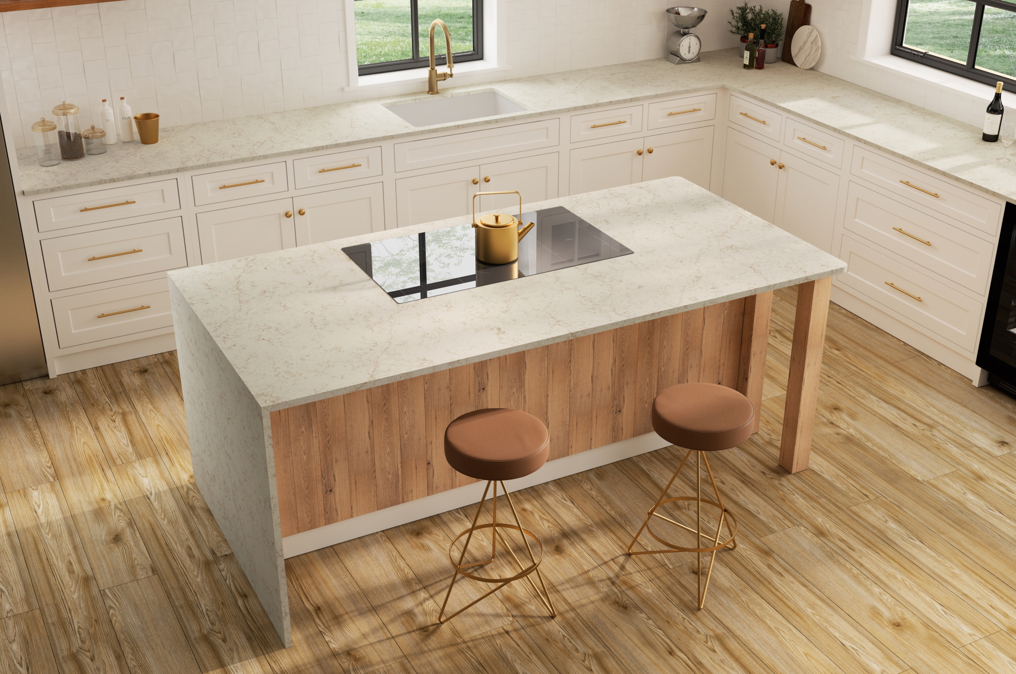
Use Some Plants
But natural beauty shouldn’t stop with wooden shelves and painted cabinets. Using green leafy plants as a corner accent or shelf decoration adds a pop of natural color to the room. You can also use multicolored flowers to create a cheery or calming vibe depending on your preferences.
Consider Light Levels
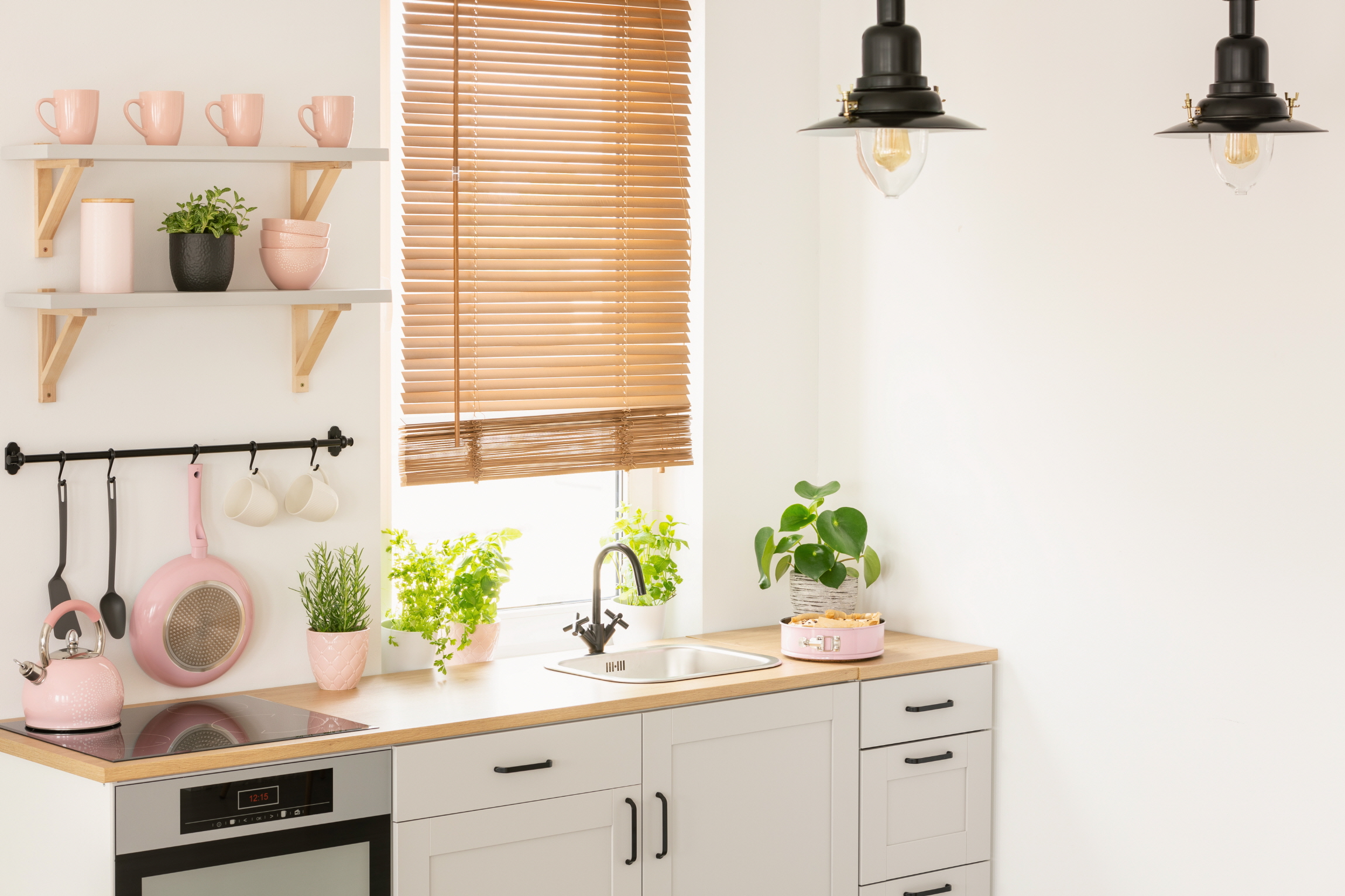
Some rooms will naturally be brighter than others. A small kitchen that you illuminate with natural light and a couple of warm fixtures won’t be as bright as one with bright eggshell flood lighting or massive ceiling fixtures.
Layered lighting is a visually complex way to incorporate multiple light levels into a kitchen. Bright flood lighting over cooking areas illuminates it to make chopping veggies and prepping meat easy. Natural light by your island or dining table means you can enjoy a calm ambiance while you eat.
This creates depth and balance in all areas of your room!
Choose the Right Lightbulb Color
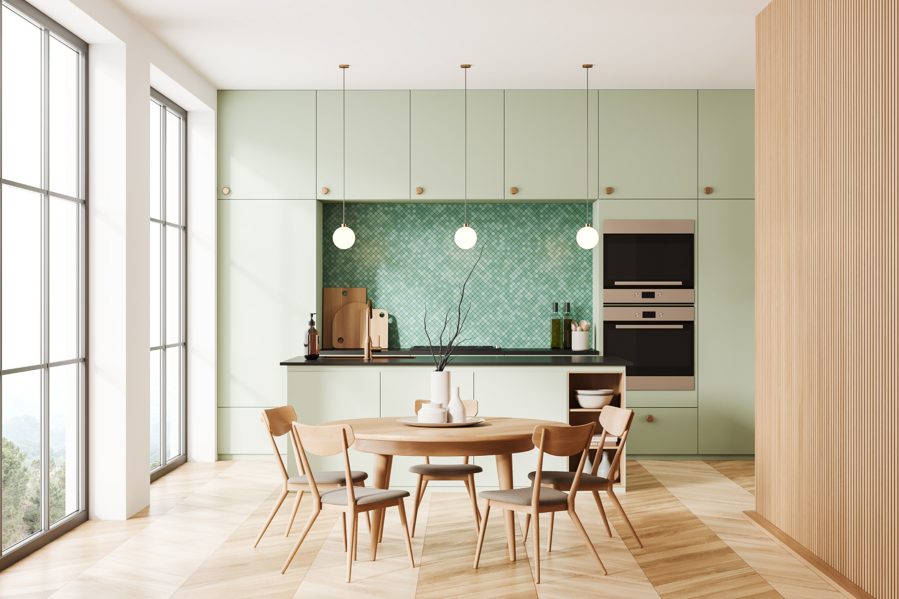
Just like some white hues are warm while others are cool, different lightbulb colors create different ambiance. Those with warm undertones have a soft glow that illuminates everything with a yellowish or creamy tinge. Cool lighting is a bit harsher, but it’s perfect for lighting up a contemporary decor scheme that you want to be bright and brash.
The atmosphere of a room changes with the lightbulb’s warmth. While soft lighting makes the space calming and gentle, brighter cool lighting is invigorating and energizing. If you like to feel serene while cooking, go with warm hues; if you entertain a lot, cool lighting will help your space stand out as modern and friendly.
Use Pendant Lighting
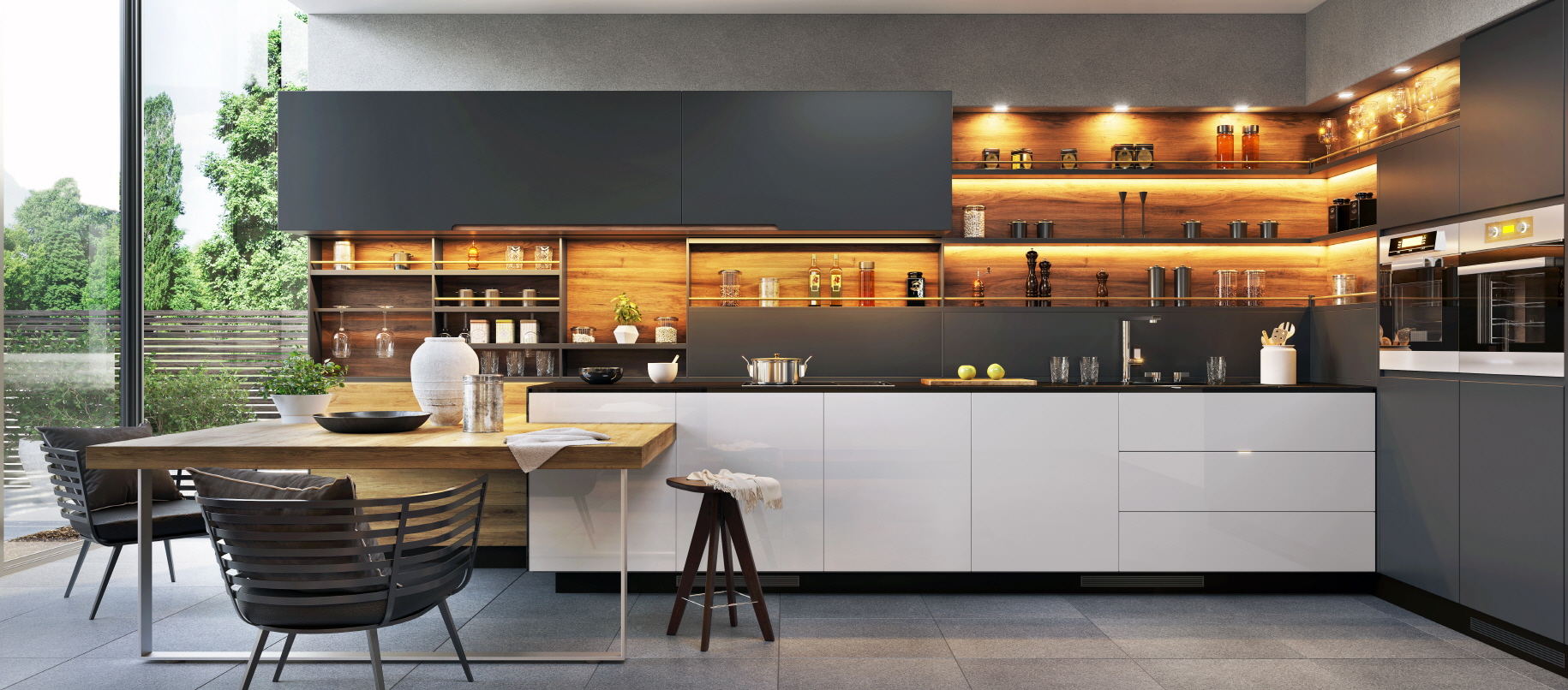
A “pendant light fixture” is one that’s suspended from the ceiling. A bulb and shade are held in place by a cord, chain, or rod made from metal. It’s securely attached to the end to prevent it from swaying or falling onto the floor.
Pendant lights are great because you can use any type of shade over the bulb. Glass or metal half-circles are great for contemporary aesthetics. Those opting for a modern or vintage look will appreciate cloth circles with interesting patterns on the fabric.
Maximize Natural Light
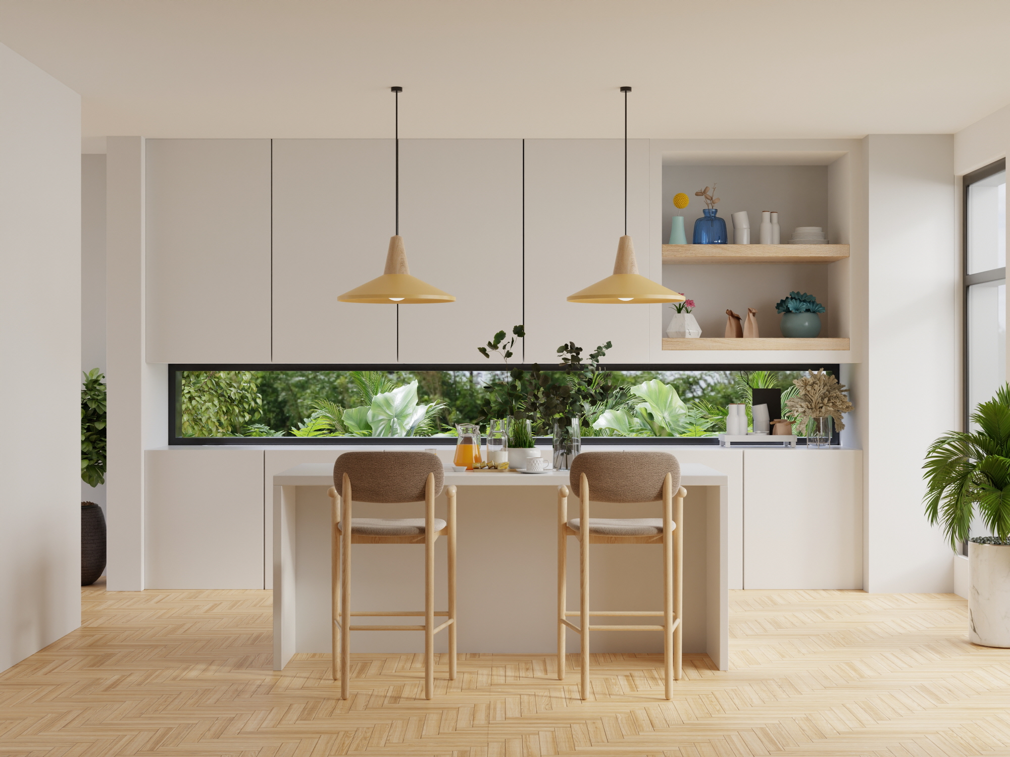
Natural light is lively to look at and reduces a lot of stress. You might feel more productive because of it. Plus, since it doesn’t affect your sleep in the way that bright artificial fixtures do, you’ll likely feel more energized while cooking and prepping meals in the kitchen.
Add some extra windows to your small kitchen during your next renovations. Make sure that they’re big enough to flood the room with sunlight. If you can’t make foundational alterations to your house, switch out your curtains with sheer alternatives and shades that you can roll up and down to let more light in.
This is a great way to make your white small kitchen feel bigger than it is. It also works wonders for enhancing the natural feel of your space, so add some wood fixtures and plants to areas with lots of sunlight.
Use White Furniture
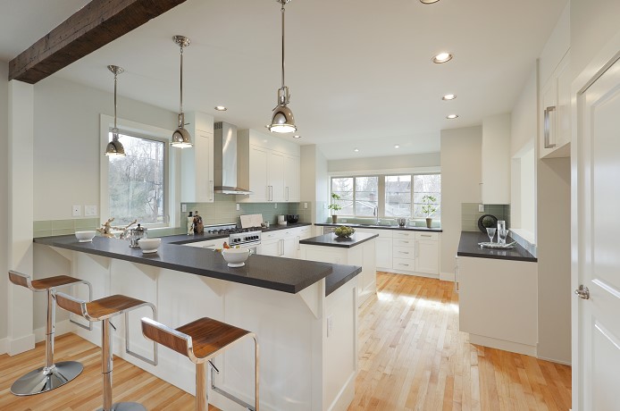
If you want a white kitchen, all of your furniture should be white. This includes countertops and cabinetry, but it goes beyond that, too. All of your chairs, stools, and dining tables should be white (and clear, if you want to include some glass.)
Making sure that all of your furniture is white unifies your kitchen. If gives it a sense of completion and unity, drawing all parts of the space together.
Install White Appliances
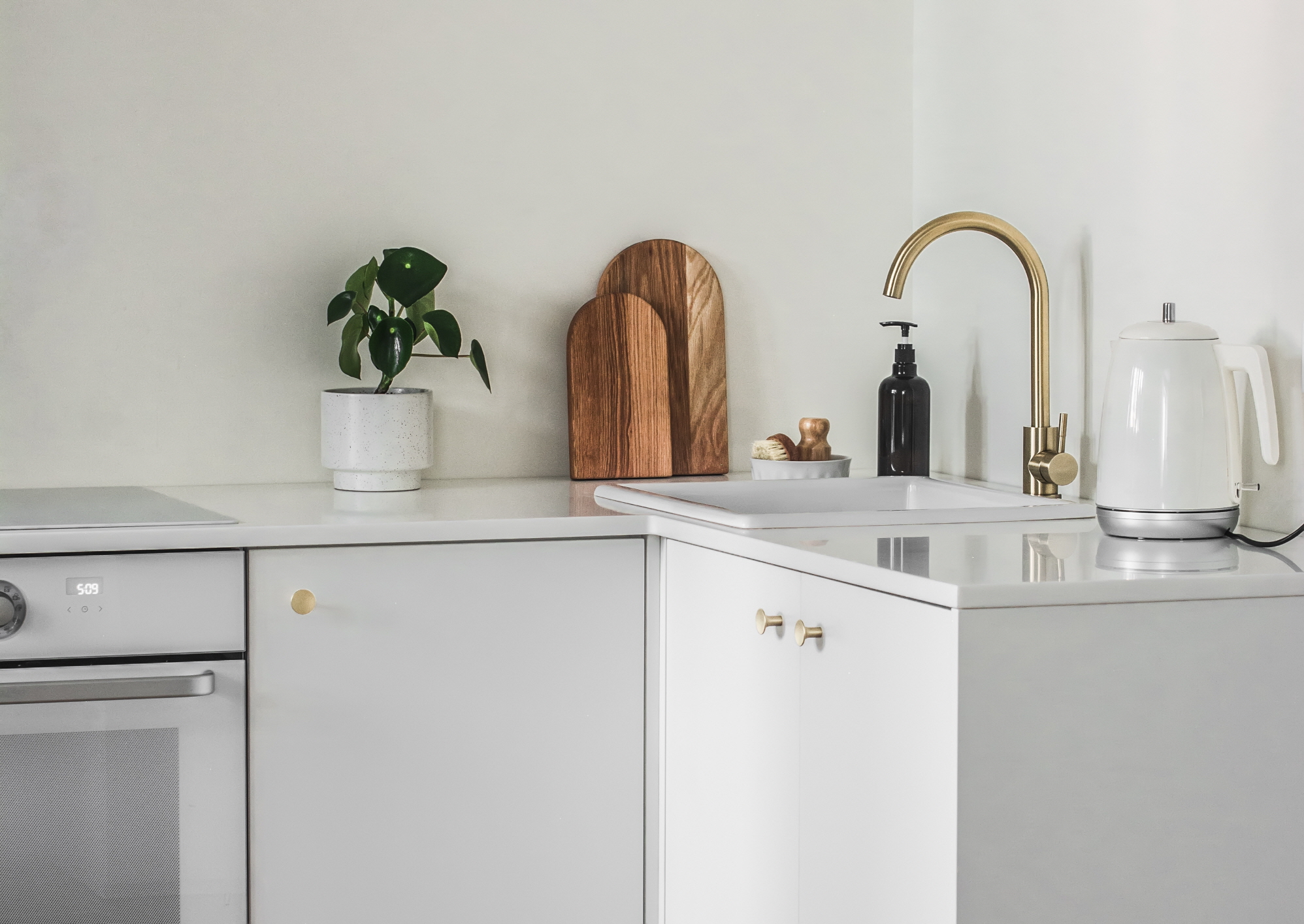
White appliances are important for the same reasons as white furniture. Your refrigerator, freezer, oven, stovetop, and sink should all be white if you want a white kitchen. This will create a sense of cohesion between all of your appliances as well as the white furniture you choose.
Keep It Classic With Vintage Decor
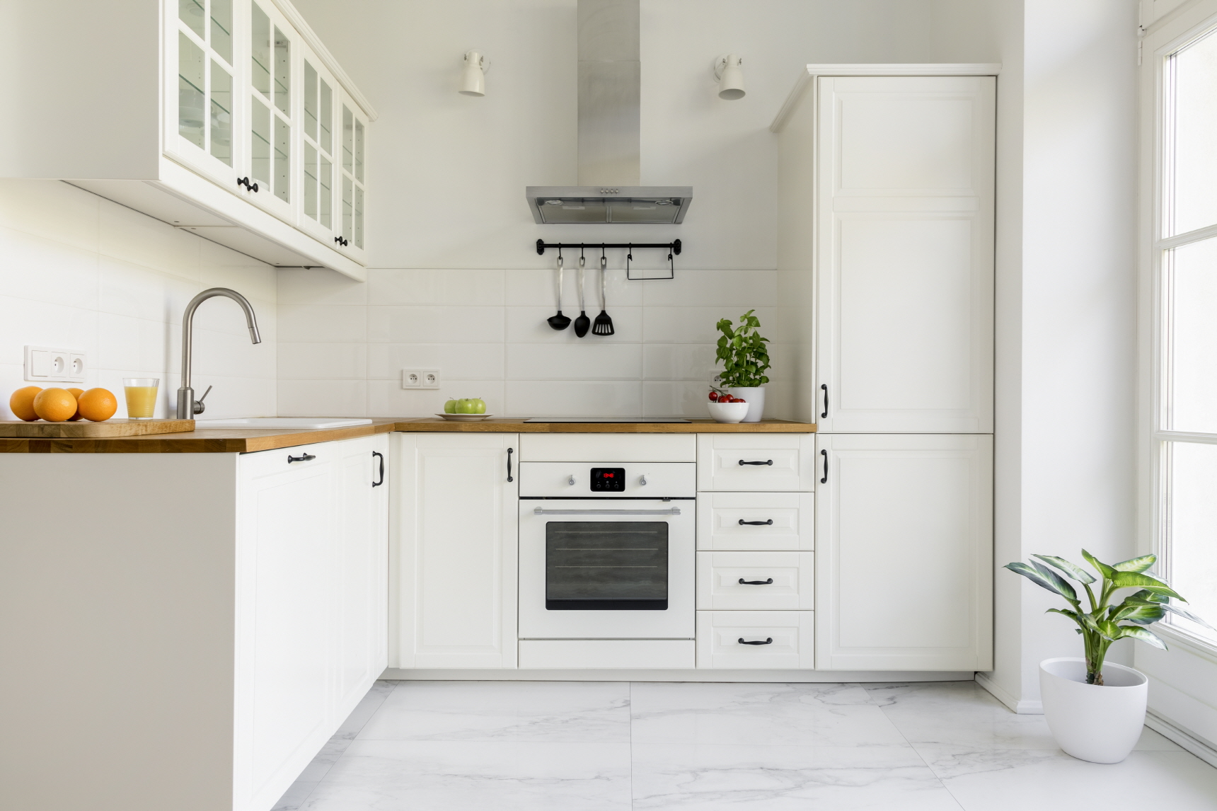
Vintage decor features designs that induce nostalgia for the mid-20th century. Wall art that shows off various food ingredients like bread and cheeses was popular back then, as were ornamental accents like analog clocks and depression glass.
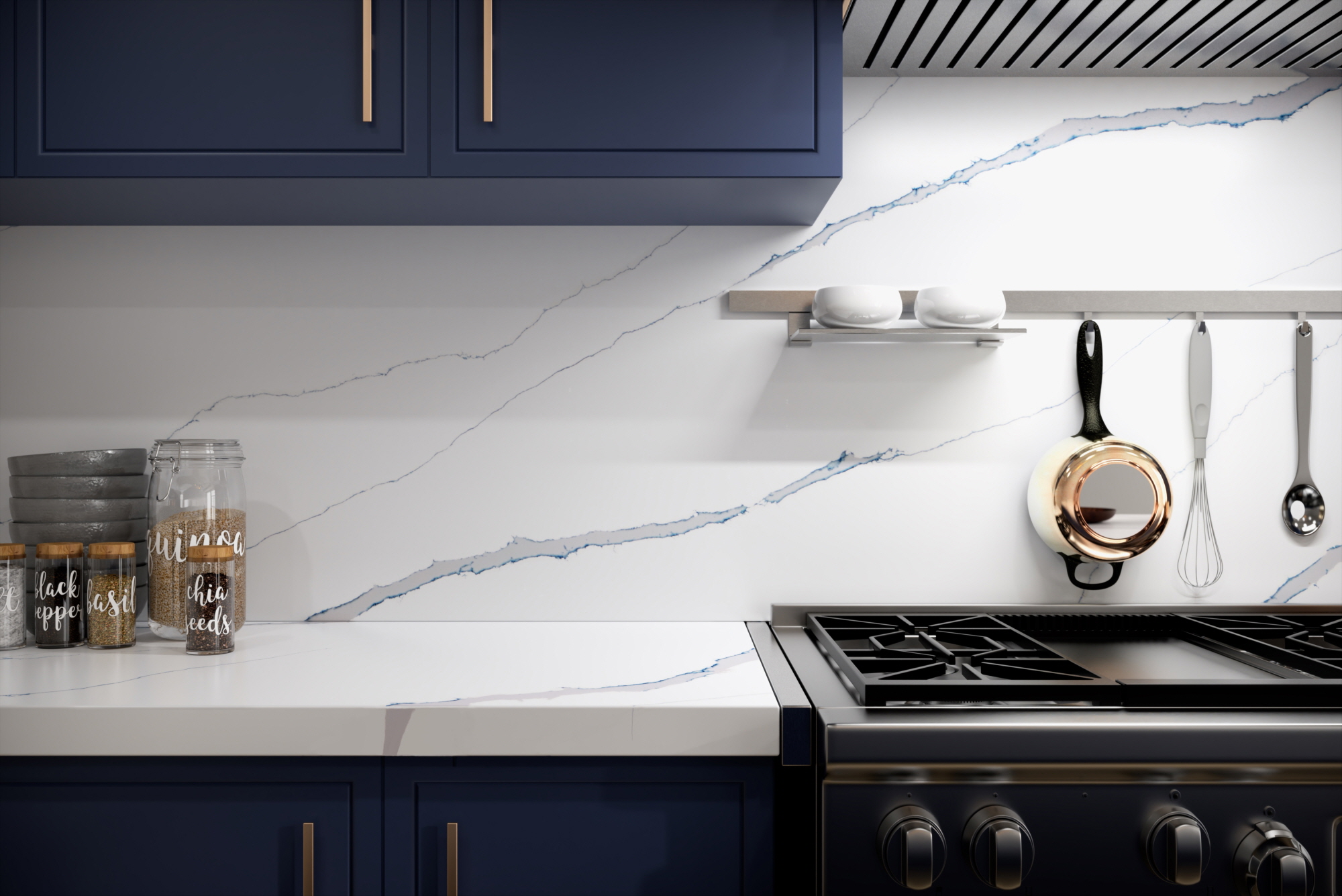
Pastel hues were also popular in vintage design. A VIATERA quartz countertop with light blue veining or a pale yellow cabinet will make you feel as though you’ve been transported back to simpler times. They’re a great way to add a pop of color to any white kitchen space!
Old & Modern Mix & Match
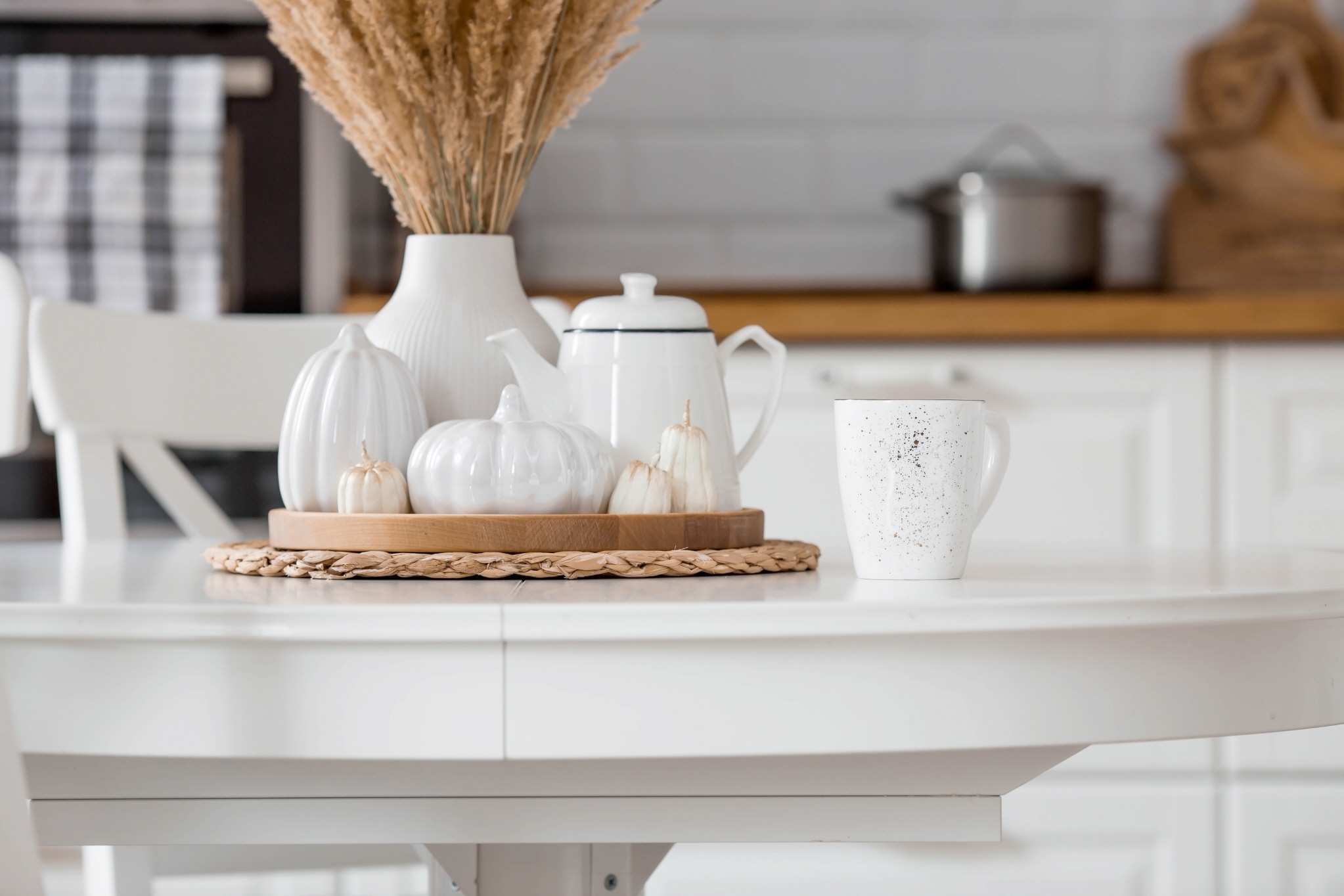
Vintage decor isn’t the only way to go old school in a white small kitchen. You can also add antique elements like ornamental china vases, thin porcelain saucers and teacups, and dried flowers.
Other modern design aspects can enhance the antique feel of these features. Consider incorporating bright lighting and modern engineered countertops. Pair the pale pink of your dried flowers with a rose-tinged glass shade over your contemporary pendant lights.
Add Accents With Glass
Whether you like clear glass or frosted alternatives, you can add gorgeous glass accents to your space for texture. Frosted options make great vintage vibes while clear glass is cool and contemporary. Consider white glass light fixtures or backsplashes in multiple tinted colors to stand out in a white kitchen.
Install Pale Shelves
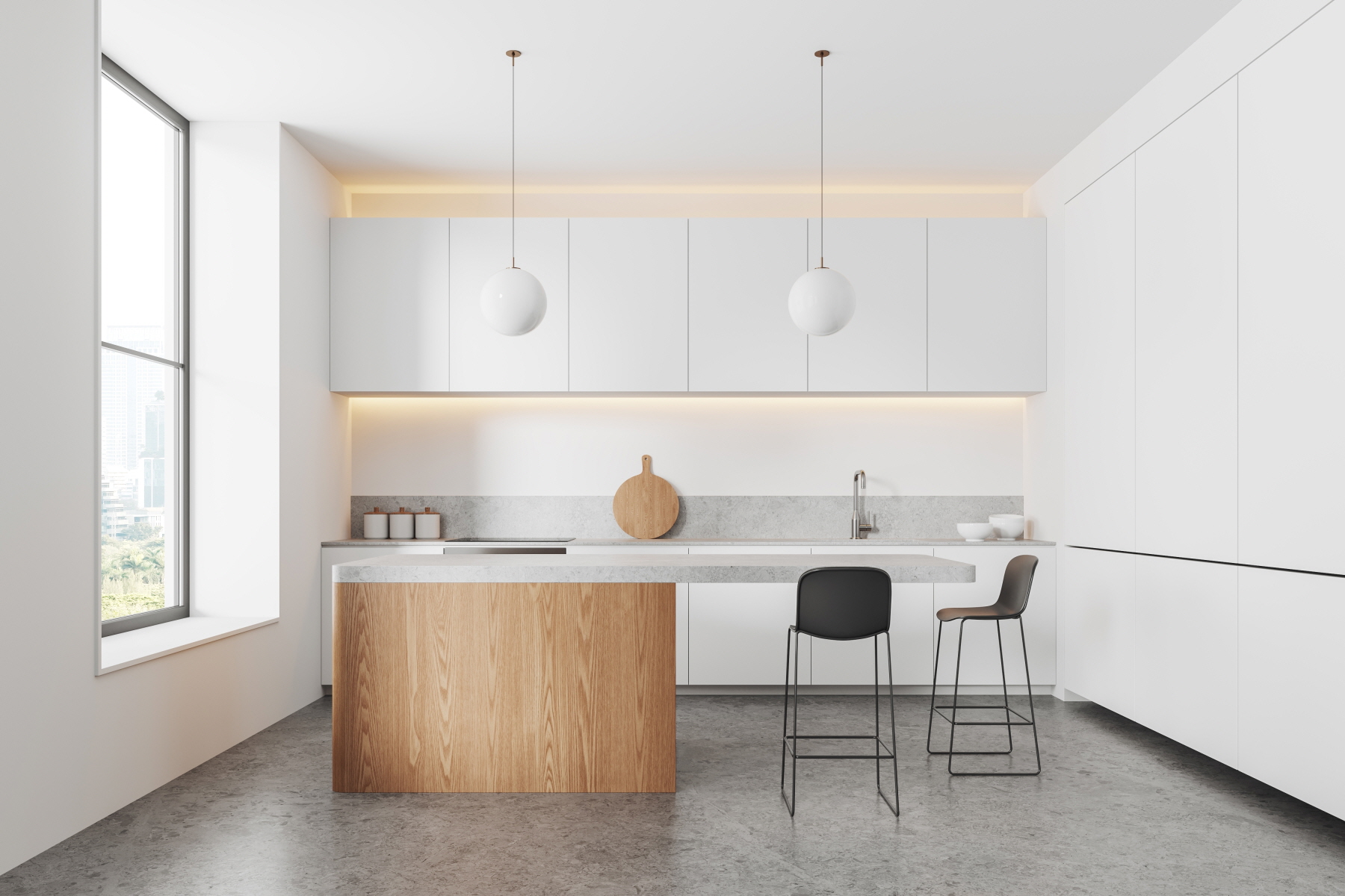
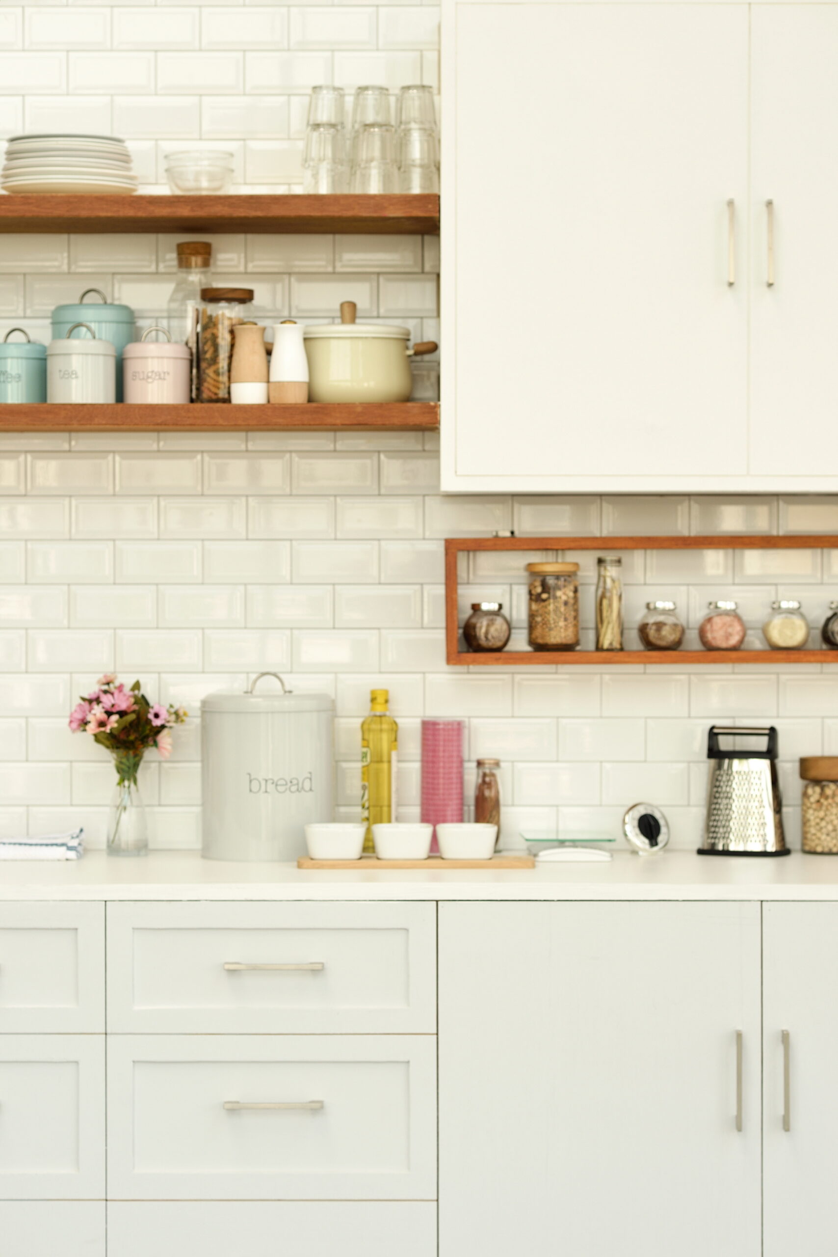
We’ve been talking a lot about the white kitchen/pale pastel accent duo lately. One great way to take advantage of this classic combination is to install floating shelves in several different pale hues. When you have a white wall and white quartz countertops, these pale hues stand out starkly as though they’re bright and flashy.
Mix White and Beige Colors
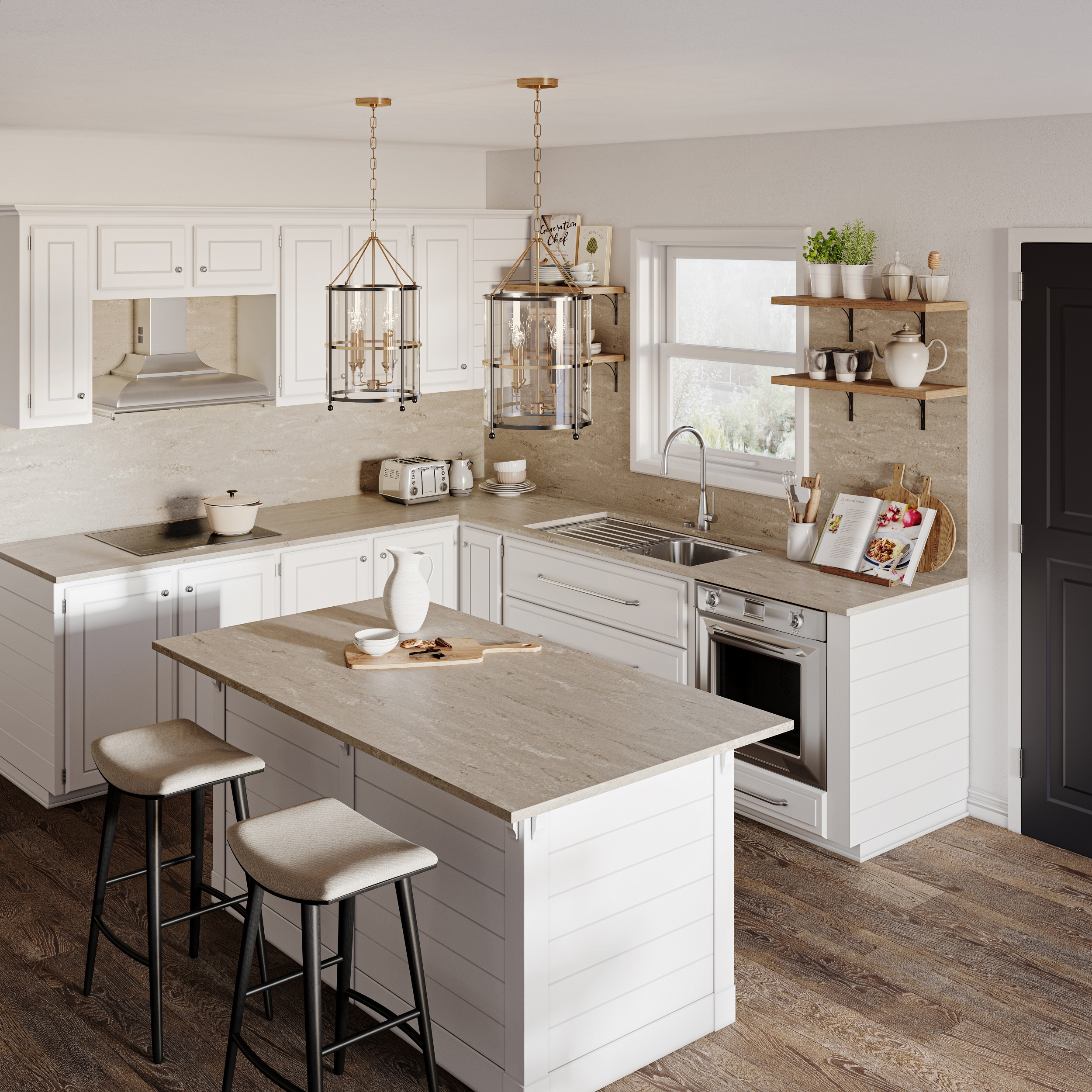
If you’re not a fan of pastels or don’t want to go too vintage, beige is a neutral hue that can add some warmth to an otherwise cool space. It goes great with eggshell white flooring or Iberia or Willow White countertops from LX Hausys.
This is a great way to create some warm/cool contrast without deviating from neutral colors. However, you can also pair beige shelving and cabinets with soft lighting to bring out its warm tones. The possibilities are limitless depending on how much contrast you want.
Accent With Contrasting Colors
Contrasting colors have distinctly opposite features to one another but still look amazing together. For example, bright blue and enlivening yellow respectively have cool and warm undertones. They sit on opposite sides of the color wheel.
And yet, they complement each other because of their brightness and outdoorsy vibes. Choose two complementary colors and add them to your otherwise white space in small bursts. A pop of color is key to visual complexity and depth.
Brighten Up With Gold Color
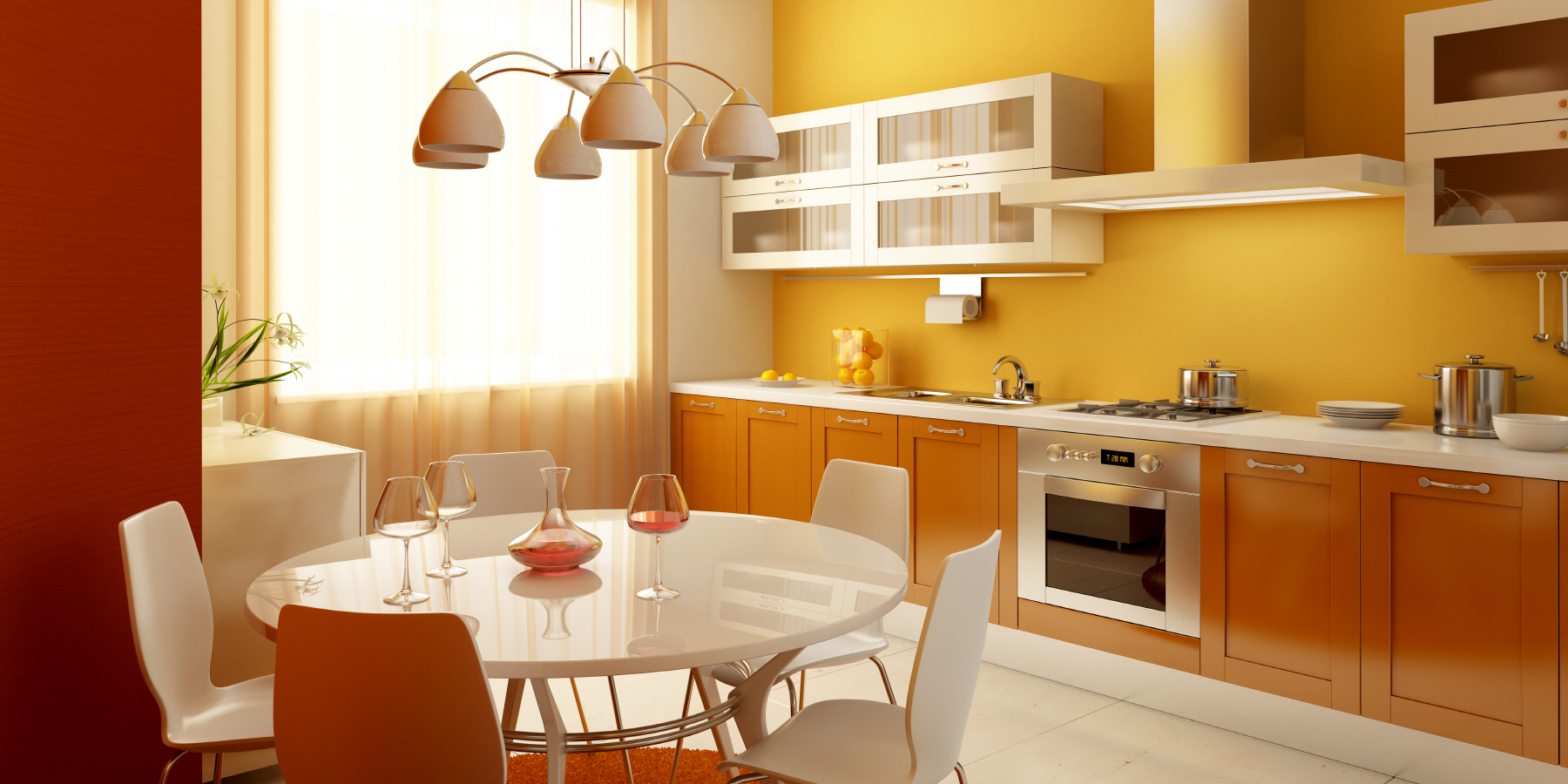
Gold is a great hue to match with white because of its shimmering high-class appeal. It makes a small space look elegant and elevates it beyond its size. Gold metallic accent walls or shelving are great choices, but you should also get gold-veined white quartz countertops like LX Hausys’s Adagio Gold slabs.
Accent With Metallic Materials
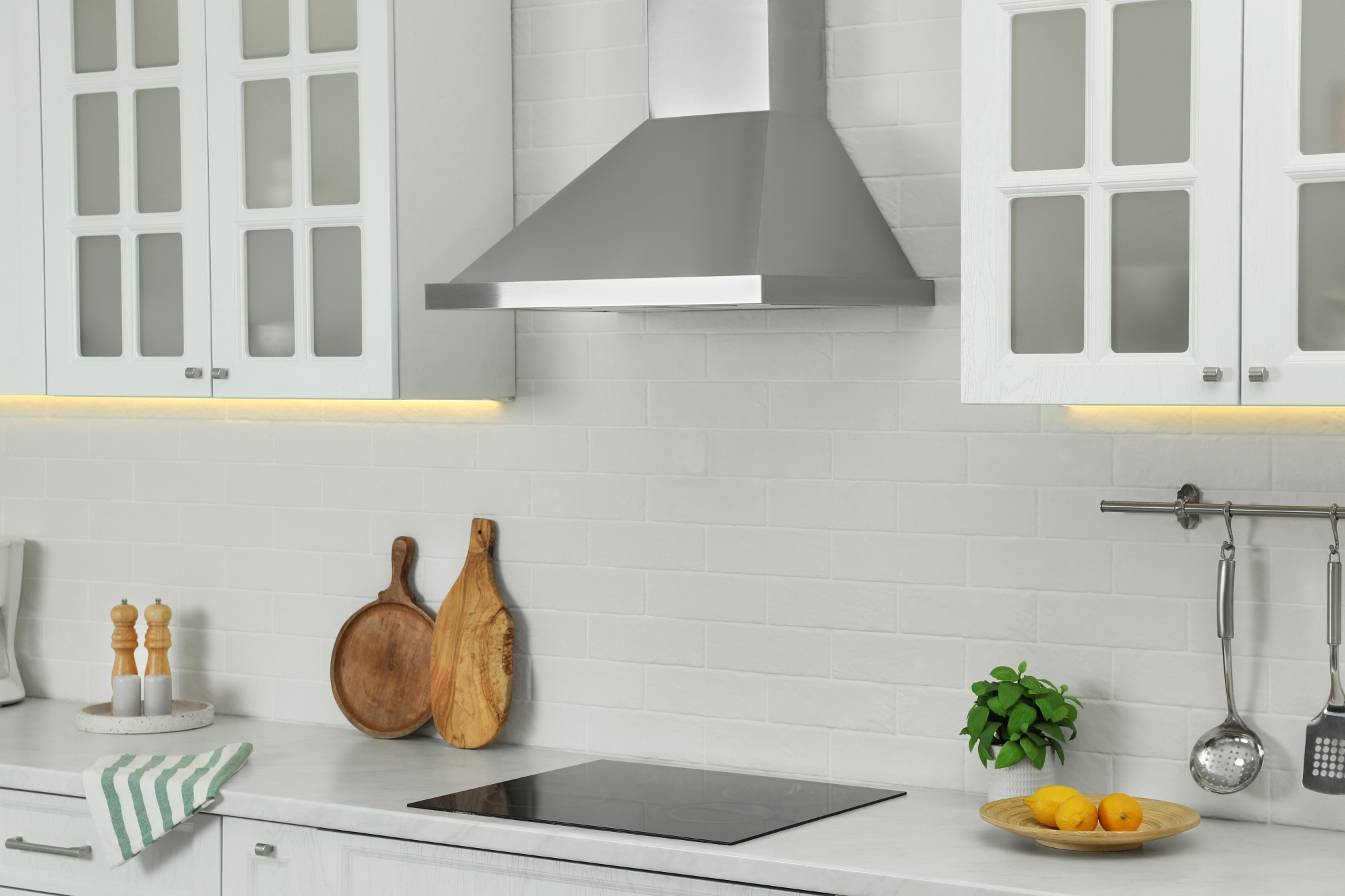
Metallic materials are unique and make for a great focal point in a white kitchen. They don’t just add a pop of color – they also create a shining surface or accent that draws the eye in a certain direction. They’re a chic way to spruce up your kitchen design.
While metallic countertops aren’t as good as VIATERA quartz or similar materials, you can use metal in many other ways. Pendant lighting can feature metal hanging fixtures that hold lightbulbs. Wall art, shelving, and decorative countertop vases and bowls made from metal can add some shimmer to any space.
Remember that not all metallic materials need to be gold or silver. If you need a pop of warmth to contrast with an otherwise cool white color scheme, metallic red accents are a great choice. Blue metal wall art gives some contrast when placed under soft lighting to give your space more visual complexity.
Add Artwork
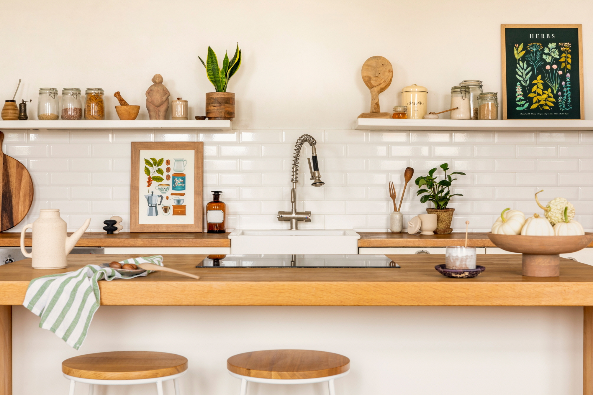
Metal wall artwork shaped to look like the sun and stars is a great way to decorate your space. However, you can also add gold-framed paintings and charcoal sketches to your walls.
This fills up extra unused space to create a sense of balance. You won’t need to worry about your small kitchen looking lopsided because it lacks decoration in some areas.
You also can express yourself by choosing art that you like looking at. It’s a way to make your small kitchen space your own while increasing home value.
Consider the Texture
Different floor, wall, and countertop surface materials have varying textures.
Porcelain tile floors are smooth and cool. Laminate alternatives and vinyl tiles are also smooth, but they have a more matte texture than glossy porcelain usually offers. Glass tiles are beautiful because of their translucence, but they break easily and are therefore harder to maintain.
When it comes to walls, particularly accent walls, you should use porcelain or glass. Both are smooth and shiny, which adds some bright texture to your room. They contrast with soft lighting and shine under cool light fixtures, making them versatile and refreshing.
Plus, since these materials are more fragile than others, they’re perfect for accent walls that don’t sustain foot traffic, scuffing, and impacts from dropped objects!
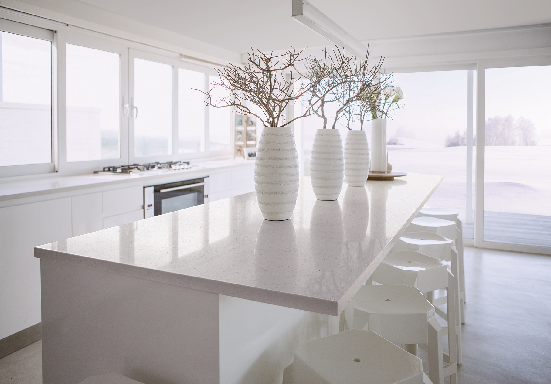
Countertop surfaces made from VIATERA engineered quartz shimmer and shine under any lighting. They’re smooth, polished surfaces that showcase different veining and color patterns. Quartz countertops are durable, non-porous, and easy to clean with a quick wipe-down.
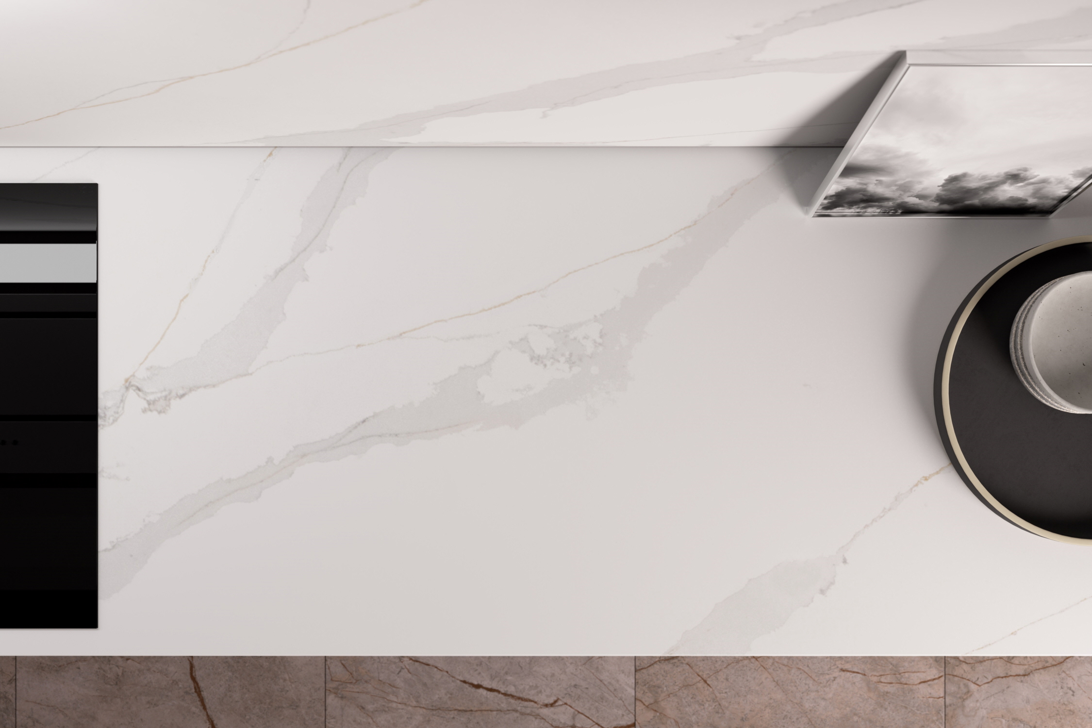
Natural stone countertops made from granite are also great for those who want a more matte finish. However, they’re a little less durable and can scratch and chip a bit more easily, and staining is easier when the sealant weakens. Quartz lets functionality meet design and offers the same beautiful styles and veining as marble or granite.
Put Some Patterns In
Veining on a quartz countertop is a type of pattern. However, you can also make white patterns on your floor by alternating cream-colored vinyl tiles with eggshell white ones. Honeycomb backsplashes also can use different shades of white at random intervals for a one-of-a-kind look that draws the eye constantly.
Point Up With Vivid Colors
Bright, strong colors can contrast with neutral hues to make your space more complex and lively. A bowl of bright faux lemons or oranges can add some much-needed vibrant warmth. You can also have bright blue or lime green floating shelves or neon red handles on white cabinets and drawers.
Make a Difference in Saturation
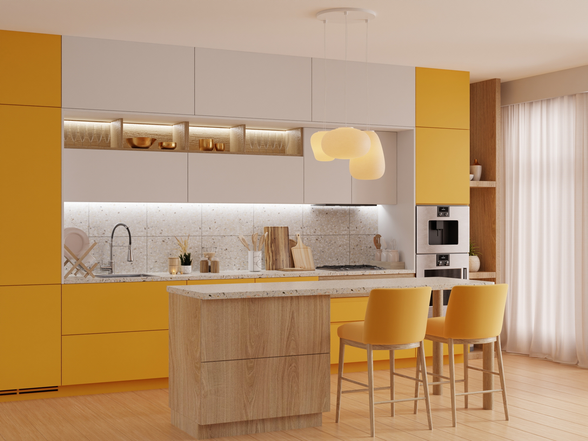
Saturation refers to how intense a color is. You can create a monochromatic color scheme by using multiple shades of white and another color in multiple saturations. For example, cornflower blue shelving and a robin’s-egg rug let blue stand out next to white in differently-saturated hues.
Keep It Clean at Any Time
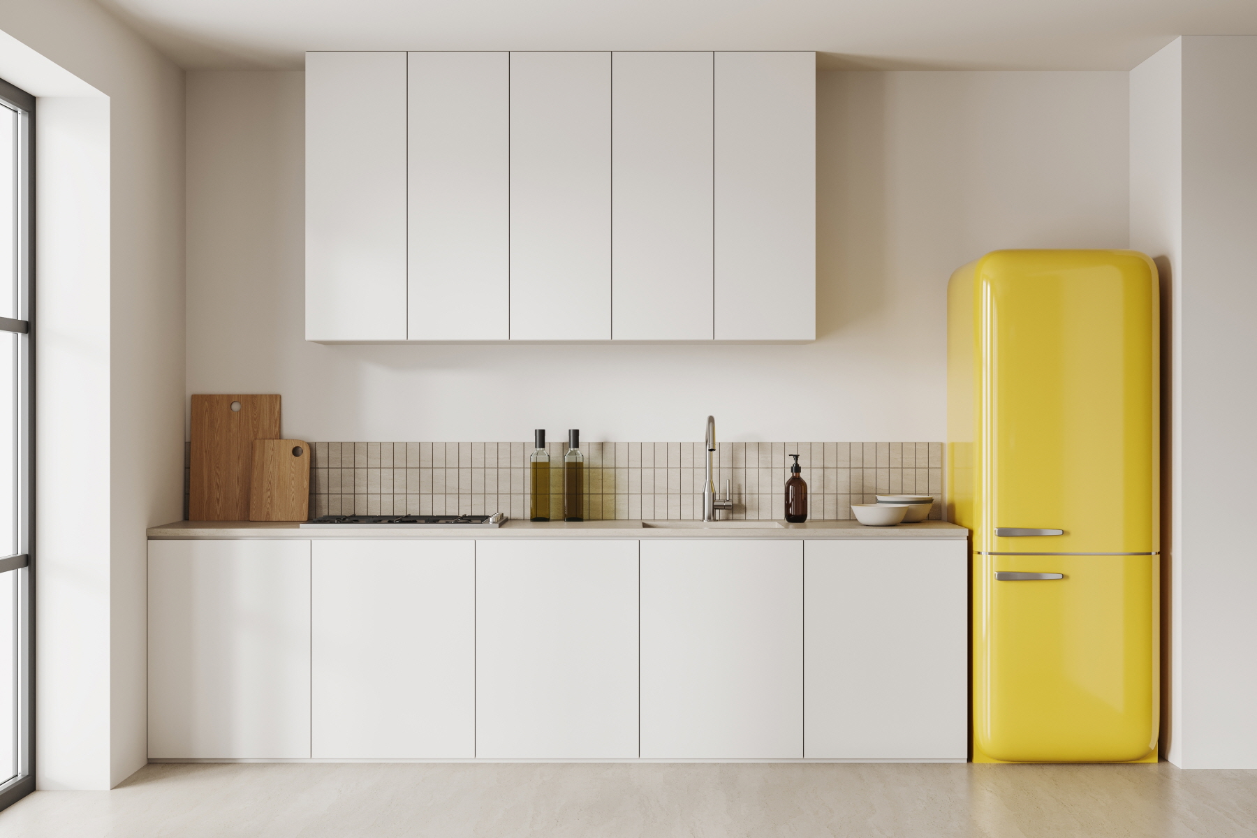
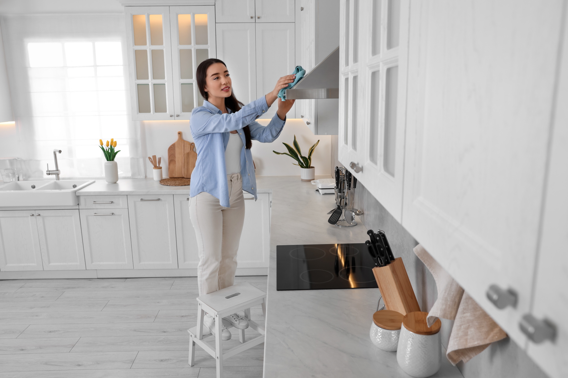
Dirt and grime show up easily on white surfaces, which means that you always need to keep your kitchen floor plan clean. Wipe down any spills immediately, dust and sweep regularly, and clean up anything sticky or powdery instantly.
Be a Minimalist
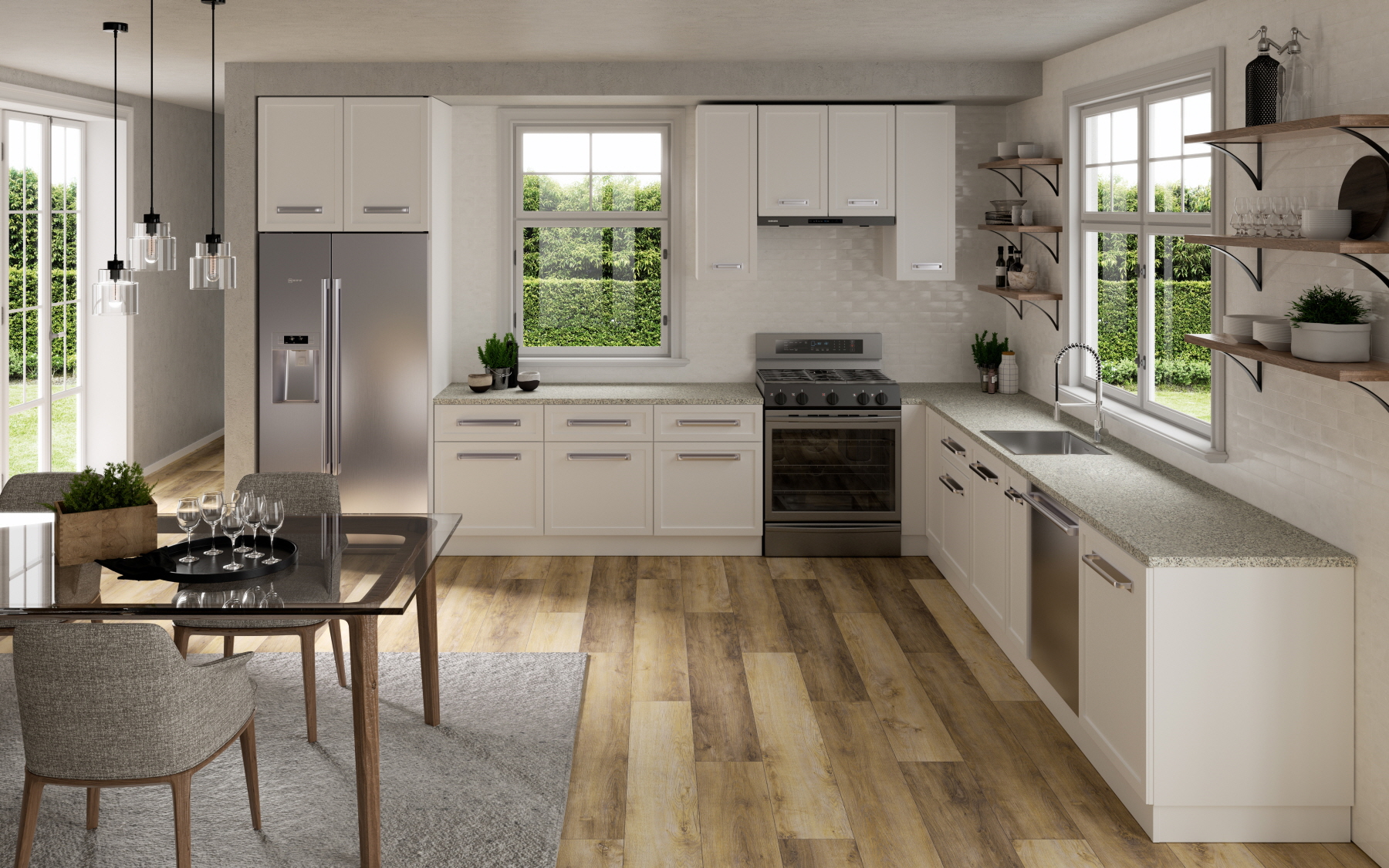
Minimalism is the idea that less is more. This means not having unnecessary clutter marring the clean, no-frills aesthetic of your white kitchen.
A minimalist design means using simple countertops, flooring, accent walls, and shelving. It also means not displaying more than you use frequently.
Hide Everything
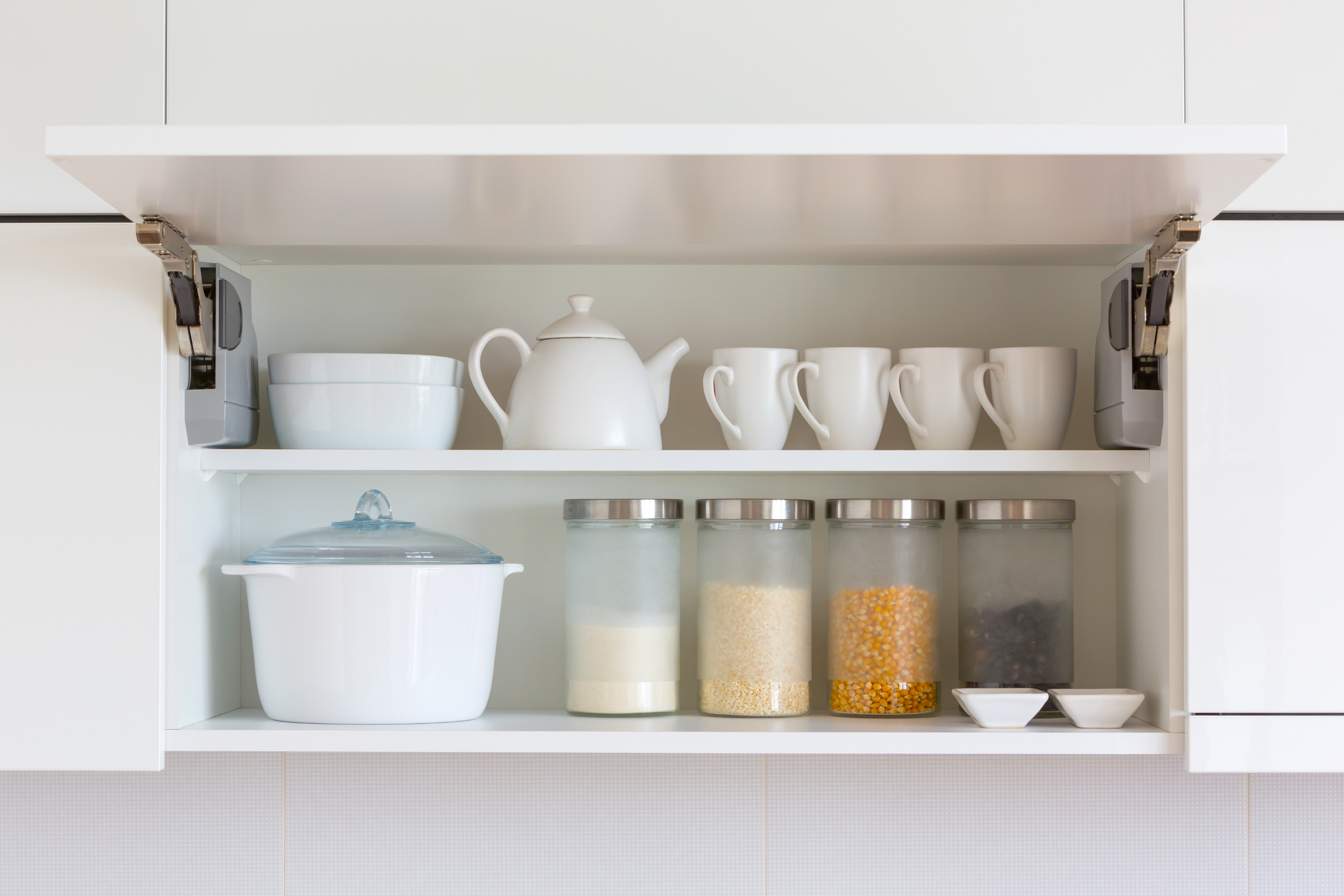
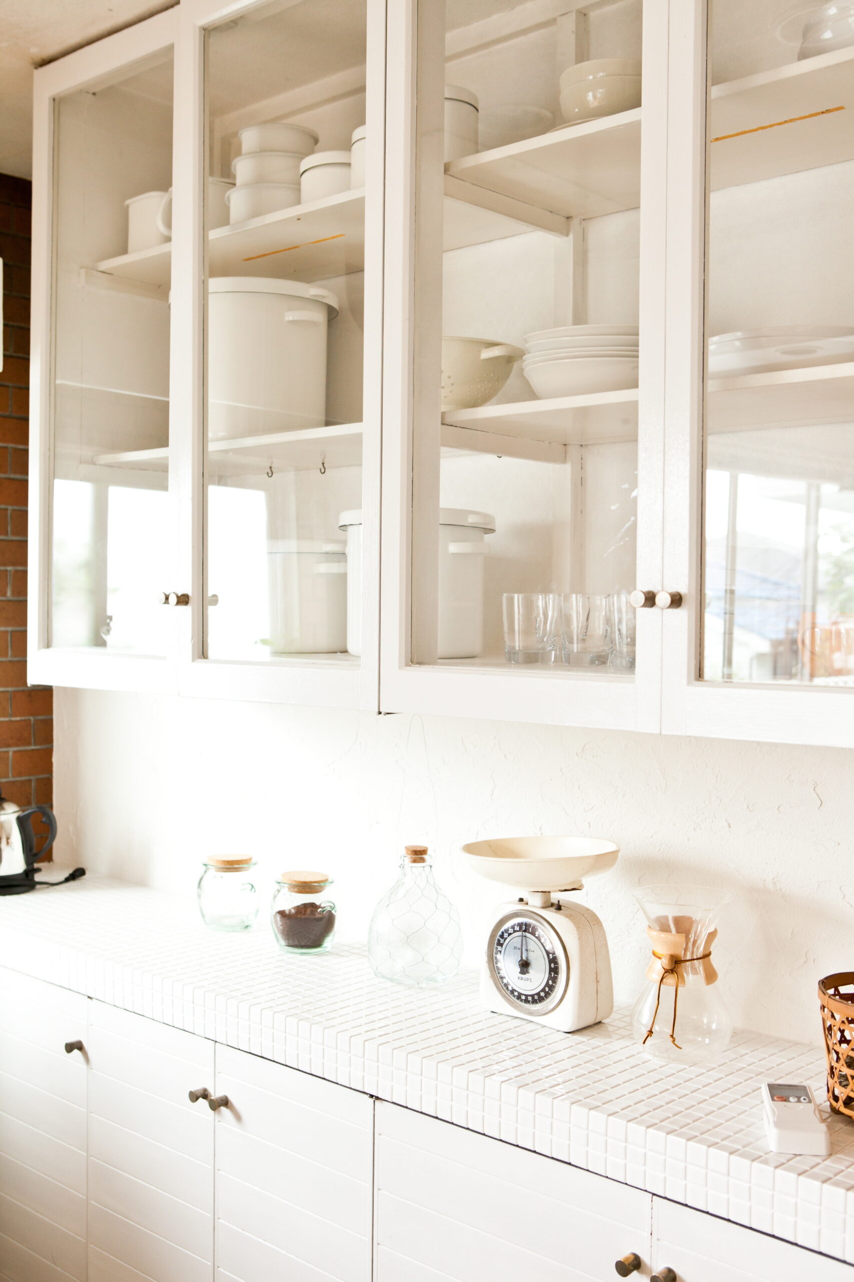
Hiding all of your dishware, pots, pans, and other useful kitchenware can help elevate your space with minimalism. You can put it in cabinets or use enclosed wall storage shelves.
Putting everything away means completely eliminating clutter rather than just reducing it. It also means remaining organized since everything will already have its place.
Put Kitchen Necessities on Display
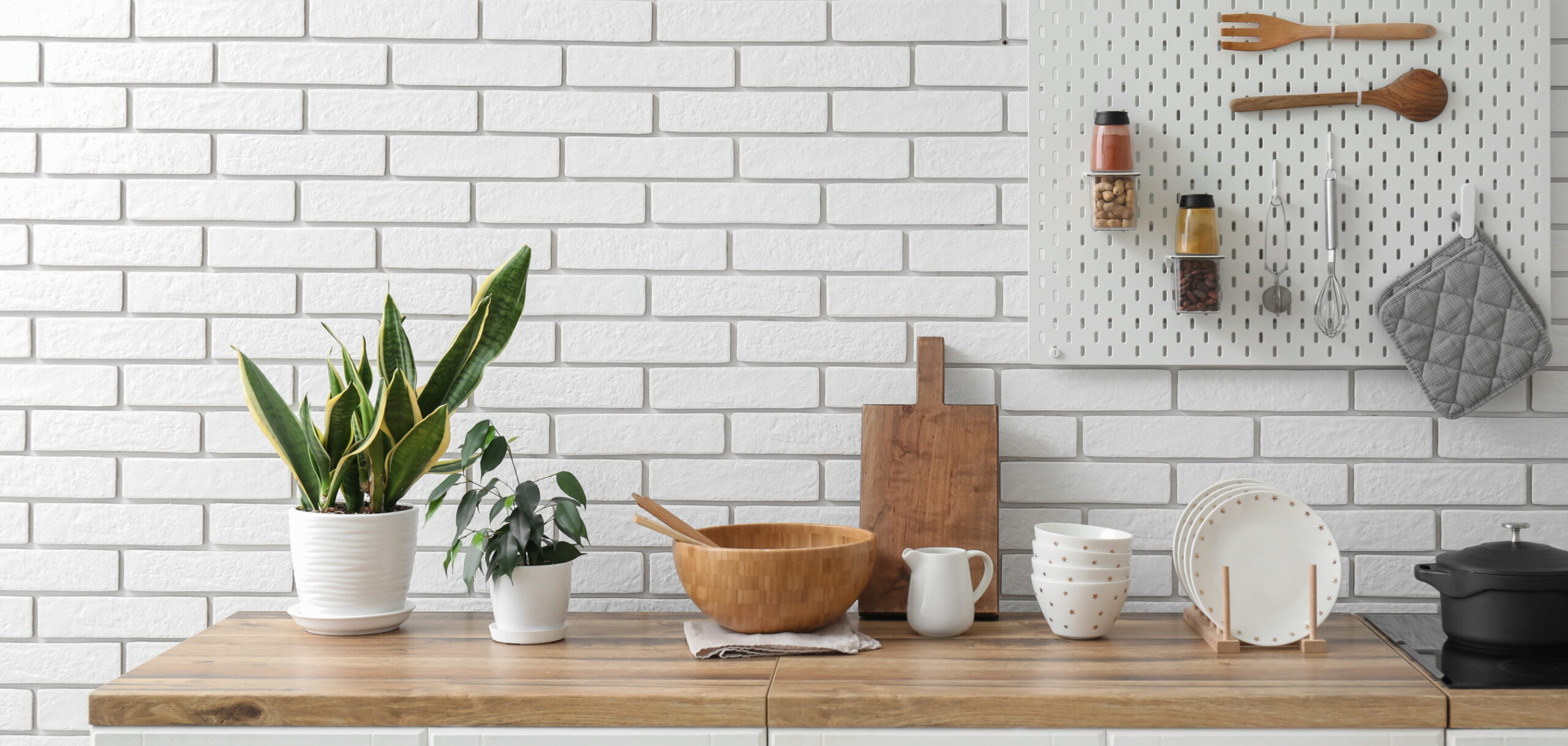
However, if you want easy access to some frequently used dishware, you can display it nicely. Pots and pans on pegboards make great metallic accents and put the viewer in the mood to cool. Well-organized black spice jars on a white floating shelf are a great way to add some contrasting neutral tones to your white space.
Use Furniture With a Storage Function
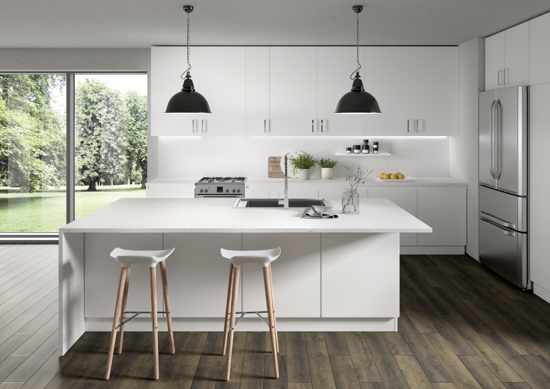
Multi-function furniture is one of the best ways to save space when you have a limited area to work with. A kitchen island with white stools that slide underneath its surface means less furniture clogging up pathways throughout a tiny kitchen.
Furniture that has storage space built into it comes in many forms. Custom white cabinets under your countertop give you a place to store cleaning supplies and spare eating utensils. Ottomans that open up to hold extra dishware make the most of every inch.
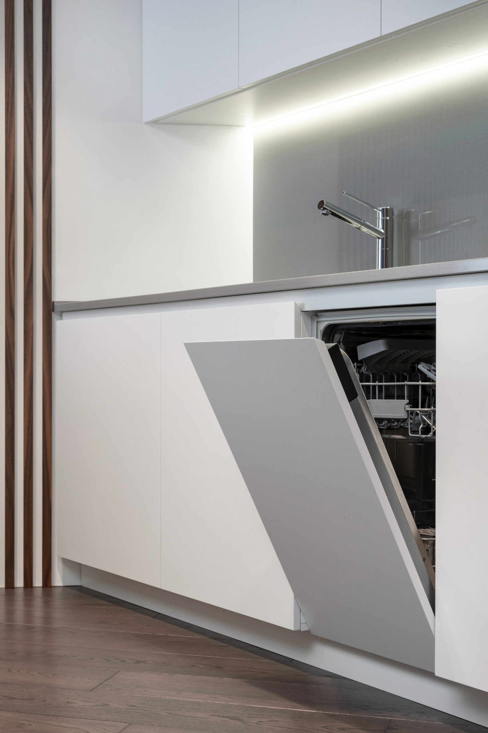
Install Built-In Appliances
Built-in appliances can make it easier to organize and arrange everything in your small kitchen. Consider kitchen islands with dishwashers built into them or countertops with built-in ovens and stovetops. You won’t need to install dozens of different things to make your kitchen functional or attractive.
Use Corner Space
Installing white shelves into your corner space gives you the chance to store things in all areas of the kitchen. These shelves are usually small and triangular, so you can store spices and coffee mugs on them. They also are great for holding recipe books as long as you keep them away from the stove.
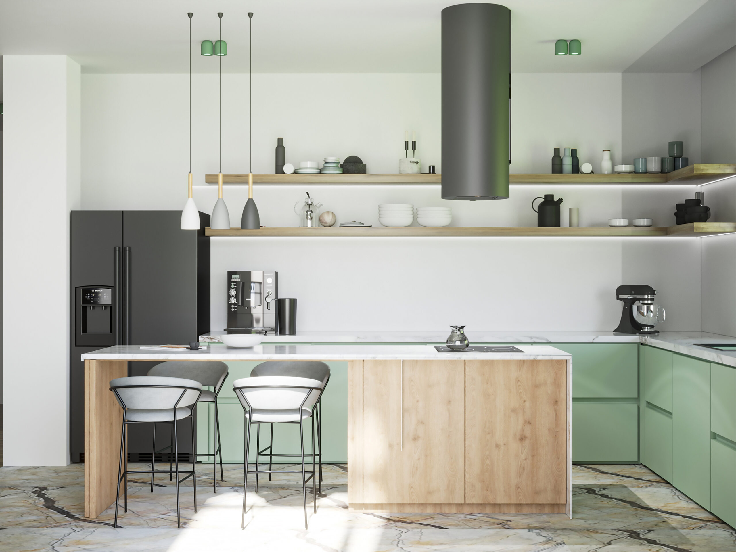
Add an Island
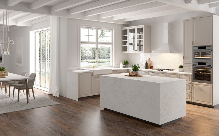
Kitchen islands are great places to cook, store things, and eat. Add one to the center of your space and top it off with Calacatta Suprema quartz from LX Hausys. Islands also are visually appealing because they reduce the amount of unused space in the center of the room, balancing everything out.
Divide the Space With Curtains
Fabric curtains are a great way to add some texture to your neutral space. They contrast well with smooth countertops and curtains.
They also serve as great dividers for eating areas and places where you prepare meals. If you prefer, you can also put cooking appliances and storage behind a curtain to hide them and keep your room minimalistic.
Implement White Small Kitchen Design Ideas
Now that you know some ways to spruce up your home with a white small kitchen design, it’s time to begin finding countertops, cabinetry, and accents that make your space look clean and simple.
LX Hausys is committed to helping you select VIATERA quartz countertops in the eggshell or creamy hues you crave. We’ll also help you design custom cabinets that perfectly fit in your kitchen space.
Reach out to our experts to discuss your individual needs and get a quote for your renovation project.
Leave a Reply